

Reinventing teletherapy by simplifying a user’s process of finding care
Project Overview
Challenge: Investing time and energy into finding a therapist is a struggle for many. People often feel stressed and anxious with their search, intimidated by the plethora (or lack) of information presented to them to find the right mental health care they need.
Solution: I created Eunoia (Greek word meaning “beautiful mind”) in an effort to help users connect to a therapist quicker and easier, as well as promote better trust and a growth mindset within the therapy process. It is an app that offers an opportunity for users to:
select from a top-tier pool of professionals OR
customize and streamline their search by getting matched to a specialist based on their unique individual preferences
learn and grow by keeping track of their therapy journey with an in-app journal and mood monitor
👩🏽💻
Timeline
6 months
Prototype Preview
Check out a walk-through of eunoia in this video. Keep reading to learn more about how it was created!
My Role
Research: user research & analysis
Design: ideation, branding, wireframing, prototyping, usability testing
🛠️
Tools
Marvel, Miro, Figma
Design Process
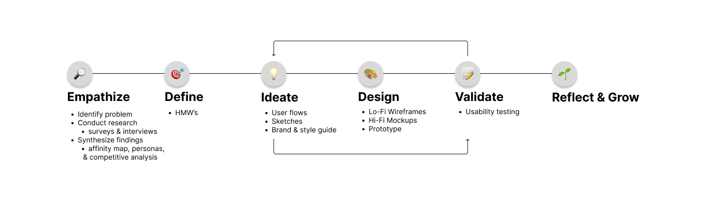
Research
Understanding the mental health crisis in the United States
Before diving into the problem space of seeking therapy, I first wanted to understand just how prominent of an issue mental health in the United States is. Thus, I began researching articles that focused on the statistics of the ongoing mental health crisis in the United States and the pain points that contribute to users experiencing difficulties when seeking therapy services online.
I found that as COVID cases began to rise in the United States and restrictions were set in place, most therapy services were forced to be offered online. Because of this shift, as well as the lack of confidence, knowledge, and insurance coverage in treatment, many people did not seek therapy between 2020 and 2021. In fact, there were an estimated 52.9 million people diagnosed with some sort of mental illness in 2020. Of that 52.9 million people, only about half (24.3 million) successfully seeked and received treatment, including therapy.
Getting to know our target user group
To gain a better understanding of my problem space, I created a brief survey and received a total of 25 responses. From those 25 responses I selected 5 participants to interview with. My main findings correlated to four themes: money value, convenience, specificity, and communication.
The full compilation of data can be accessed here: Finding the Right Therapist Survey Data
Research Synthesis
Analyzing users’ experiences with searching for therapy services
I put together an affinity map to organize all the information I collected from my interviews into bigger topic categories and find reoccuring themes.
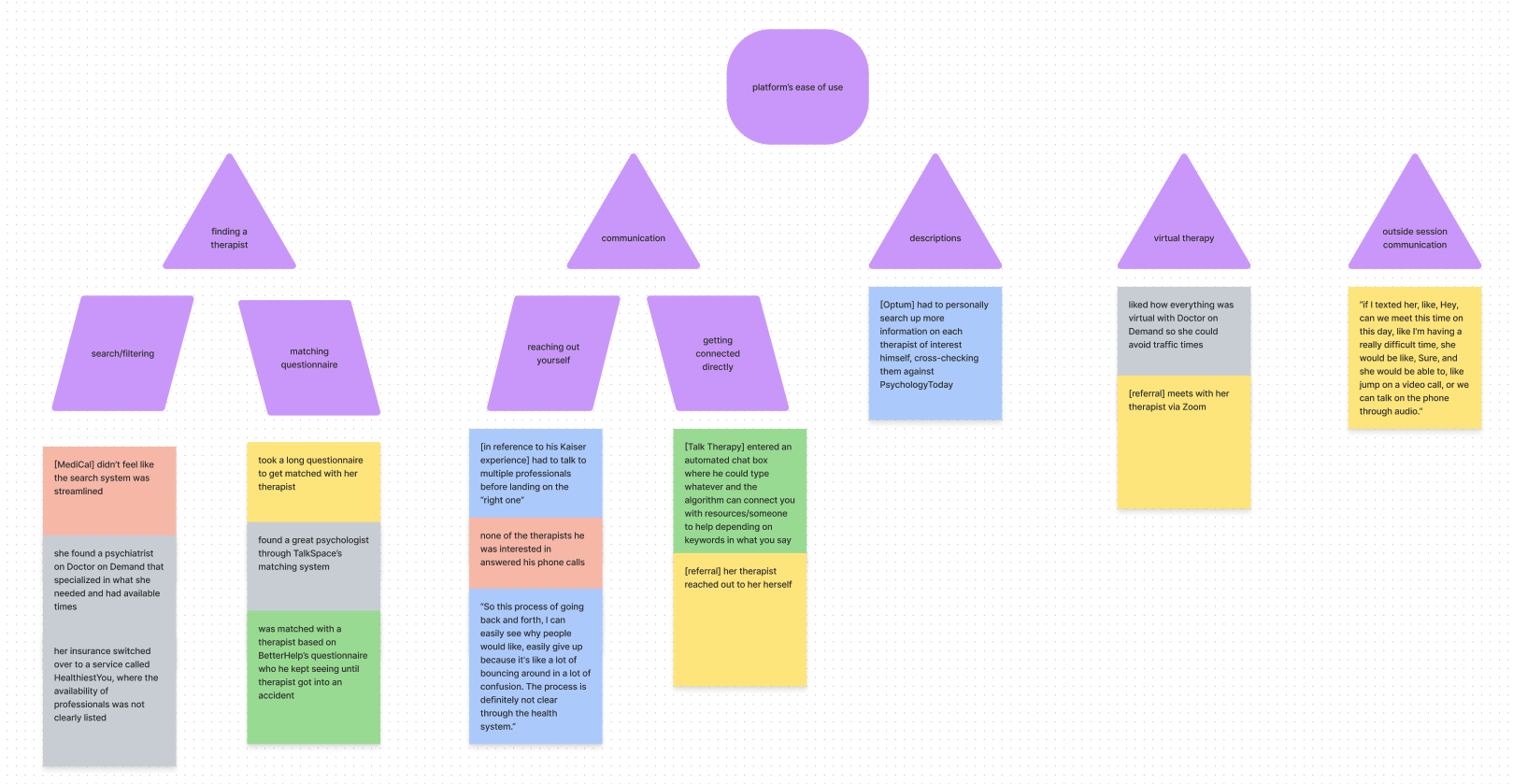
I was able to break down all the information into four main topics, which allowed me to identify the similarities among users’ experiences when seeking therapy: sources of motivation, factors they consider in a therapist, search methods and their overall thoughts on their process.
Motivation (why do they seek therapy?)
People experience anything from minor anxiety to depression, so they seek therapy to treat it
Some folks use therapy as more of an outlet to socialize
Methods (what do they use?)
Insurance website: most convenient
Mobile application: whatever’s trending
Thoughts (what do they think about their overall therapy seeking process?)
Filtering vs. matching: almost equal footing, although filtering may be preferred to better suit preferences
Reaching out vs. getting connected: also almost equal footing, although putting effort towards reaching out yourself is less convenient
People would rather have options to connect to therapist directly
“The process takes too much energy.”
“I feel stressed and anxious doing this.”
“No one accepts my insurance. ”
Personas
I created personas to further empathize with individual types of patients and showcase how certain characteristics and lifestyles could also influence their approaches and mindsets to seeking therapy. I took influence from users I actually interviewed.

Persona A: Jane, the non-tech savvy and unmotivated registered nurse
Busy bee, extroverted, works crazy hours on the health frontlines, isn’t the most tech-savvy, and wants convenience as much as possible
“I don’t have time to contact every single therapist… is there a way to book an appointment immediately?”
Goals
Both desire finding a therapist that can treat ONE disorder ex. anxiety / depression
Jane would like a therapist that is very responsive
John doesn’t mind longer wait periods, wants someone who is LGBTQIA+ friendly
Needs
both want flexibility and convenience
Jane would like some sort of instant messaging system, or a way to see/hear from her therapist as quick as possible
John would like someone he feels comfortable with, building a healthy therapist-patient relationship
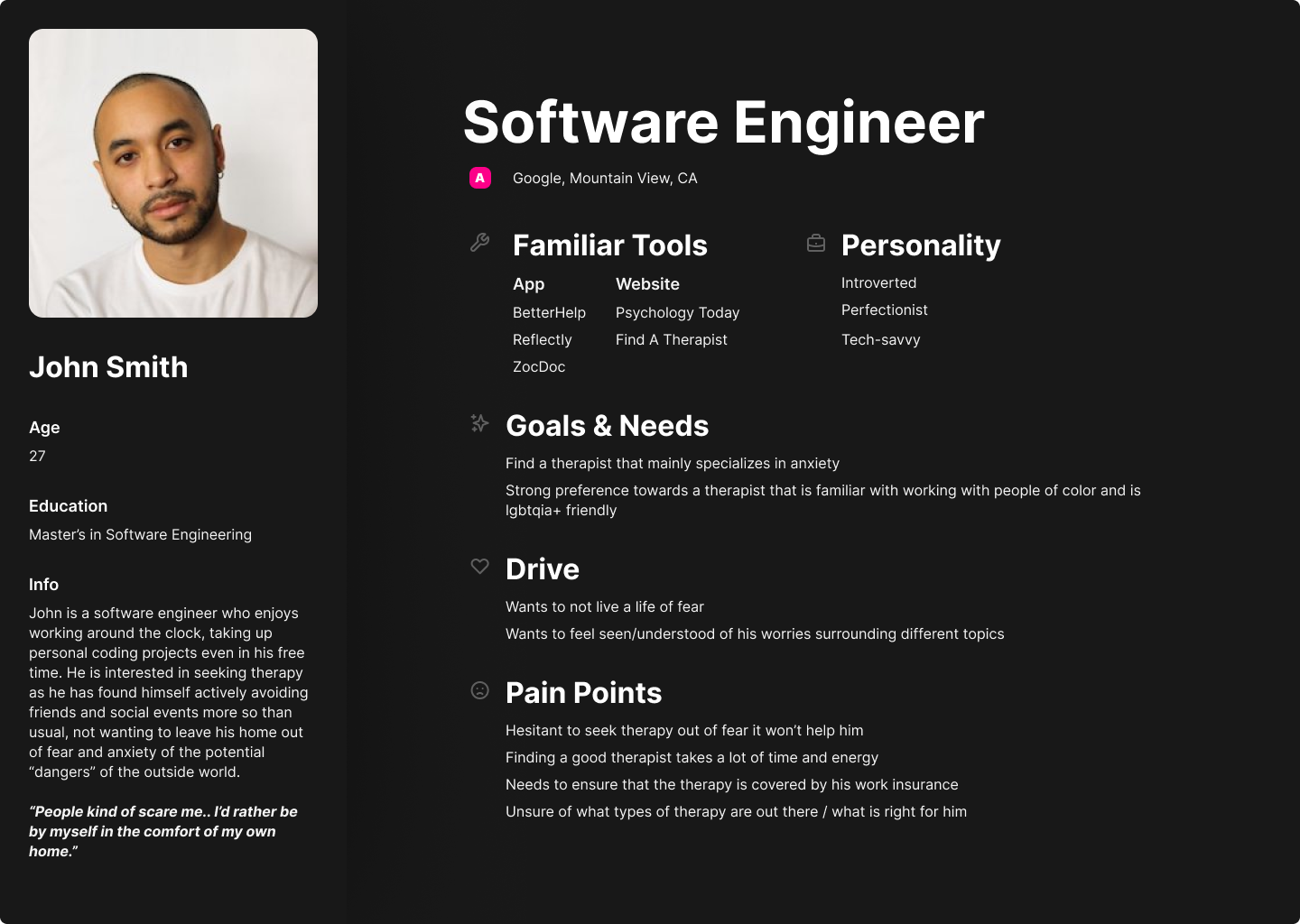
Persona B: John, the tech-savvy and motivated software engineer
Works remotely, is more reserved, but tech-savvy and knows exactly what he wants out of a therapist
““I know what I want and need in a therapist… they should check this box, and this one too…””
Both Jane & John have…
Drives
Both want to improve their overall well-being
Jane wants to be able to build healthy habits so she can excel at her job
John wants a safe space to be heard and understood
Frustrations
both have similar issues with time, effort, and energy needed to go through the process
Jane doesn’t want to jump through hoops
John is hesitant in thinking therapy could be effective for him
So… what does it come down to?
2) motivation
Users naturally seek a process that is painless as possible
If more aware of their needs, users are more than likely to have the motivation to keep seeking them; they just need a solid way of filtering to get to the specifics
1) accessibility
If not very tech savvy, user might have trouble jumping through hoops to get to someone specific so it would ideal to speak to the professional directly
“People are creatures of comfort and convenience.. they like instant gratification.”
Competitive Analysis
To get an understanding of the current teletherapy market, I studied three of the most popular teletherapy desktop platforms: PsychologyToday, GoodTherapy, and Find A Therapist.
As I assessed these platforms, I noticed that one of the biggest issues all three faced was cognitive overload. The amount of information presented with each search was overwhelming; it clearly required extensive time to look over each profile and review the statistics to find what you were looking for.
Thus, this presented an opportunity for me to place focus on the process of making that initial connection with a therapist much faster and with ease.

Finding the direction to focus on
HMW’s?
Based on my research analysis, I came up with three major “How might we?” questions that addressed the major problem areas. Coming up with solutions to these questions served as the basis of the MVP I designed.
1) How might we help users connect with a therapist quickly and easily?
2) How might we provide better control over users’ personal preferences?
3) How might we help users build trust with a therapist?
Brainstorming
Of the many ideas I had, both inspired and perhaps a little unattainable, I decided to place my focus on creating a teletherapy application that implemented two main features: a matching system and a filter-based directory. This gives both a feeling of familiarity to the user (if they used other teletherapy platforms) as well as control over their options.
Some secondary added features unique to my application include:
an introductory video displayed on the therapist’s profile that allows the user to get a further idea of the therapist’s style and personality
a mood tracker and
in-app journal that allows the user to record and view their therapy journey progress
User Flows
After finalizing what the main and secondary features of Eunoia would be, I created three major “red routes” that would serve as the blueprints for this application. Doing so allowed me to determine the amount and order of screens that would give the user the best outcome of completing certain major tasks.
#1
Conduct another round of testing to validate new changes to designs.
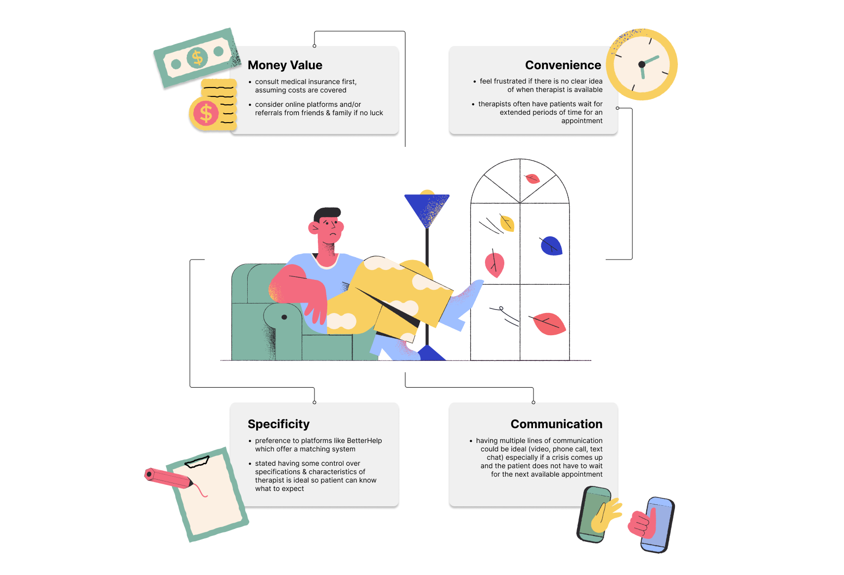
Factors (what do they look for?)
Cost: people would much rather have their insurance cover most if not all the costs
Therapy is very expensive, especially in centralized areas
Availability: people want a therapist that can find time for them amidst busy schedules
Specialty: people want to see a therapist that is good at ONE or TWO things
Licensing: there are many different types of therapists out there, but not everyone knows who they should seek out
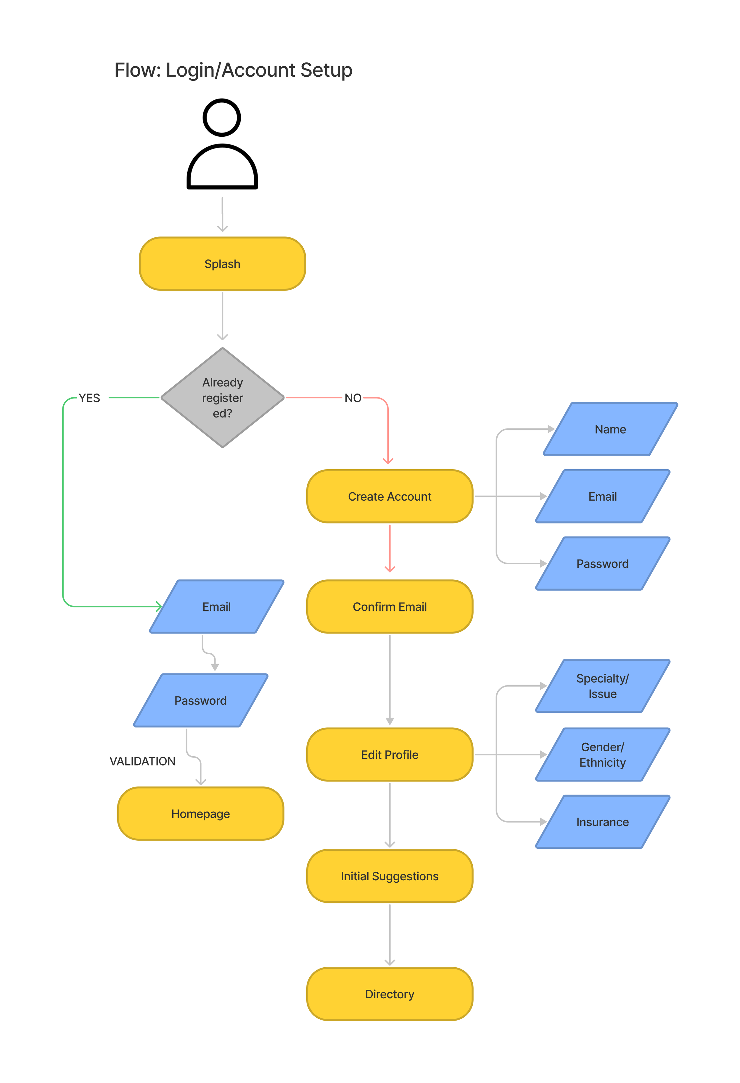
Flow 1: Logging in and/or creating a new account
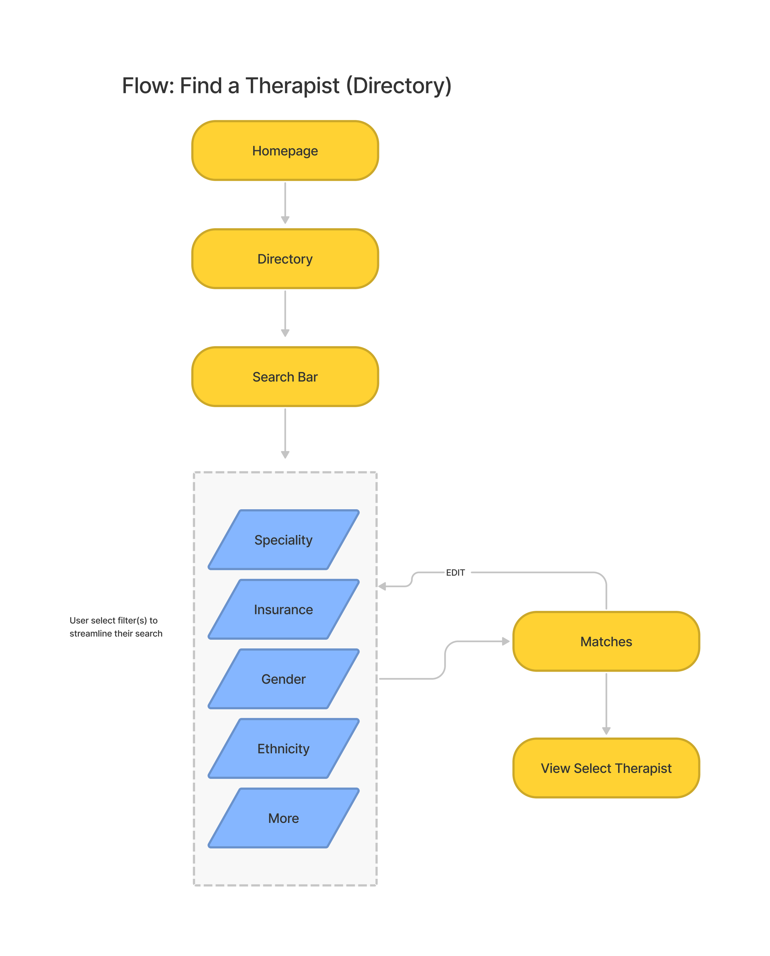
Flow 2: Finding a therapist via the directory
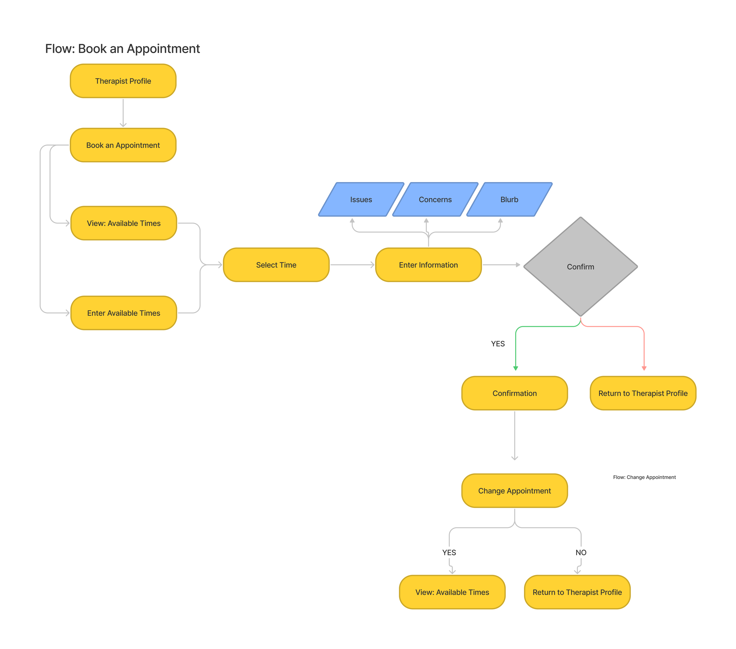
Flow 3: Booking an appointment with a therapist of interest
Sketches
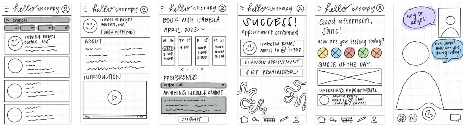
Once my flows were defined, I began creating rough sketches of each flow using pen on paper. I then translated them onto the Marvel platform so that I could test out these initial designs with real users and flag down any early issues.
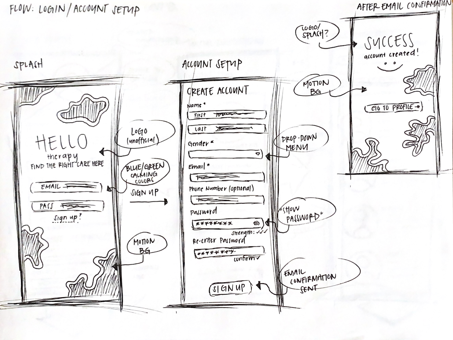
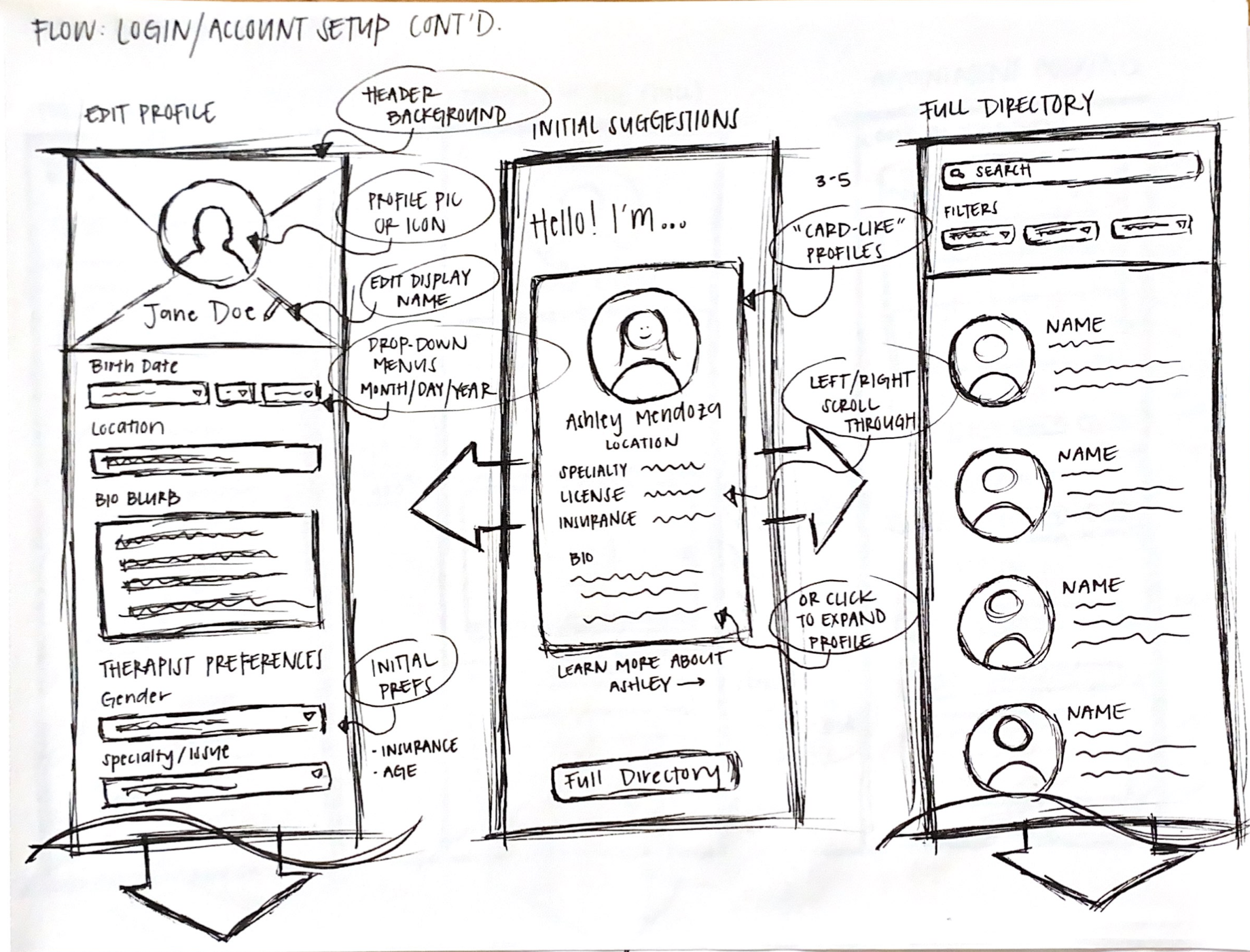
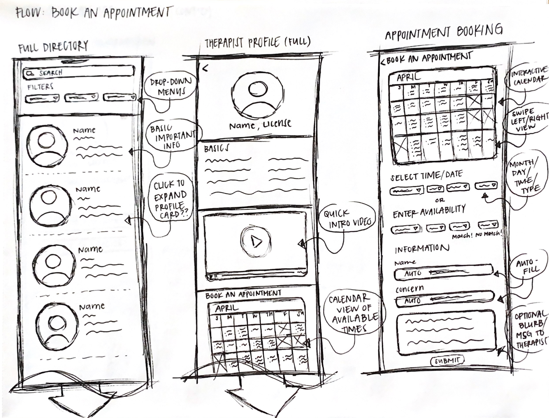
First sketches translated into Marvel for testing
Guerrilla Usability Testing
Before creating wireframes, I conducted a set of usability tests on my sketches to see what could be improved. Participants mainly provided critiques and suggestions on improving the sign up process, such as wanting multiple ways to create an account (i.e. through Google, Apple, etc). Other comments included:
grant access to the suggested therapists even after leaving the initial match screen
have the ability to bookmark a therapist to save and view later if needed
include an informational screen that tells the user what creating an account with eunoia entails (i.e. access to matching system/directory, access to therapist info & contact, etc)
Based on this round of testing, I would then focus on improving the 1) sign up process, 2) the inputting preferences and generating suggestions screens, and 3) the booking an appointment process as these elements align with my user flows most and should thus be given first priority.
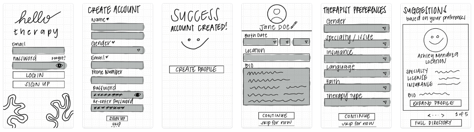
Wireframing
Using the feedback I gained from my first round of guerrilla usability testing, I began creating low-fidelity wireframes on Figma to better visualize the information architecture of Eunoia. These wireframes served as the backbone for what my high-fidelity designs could look like. I made sure to include multiple ways of logging in and signing up, as well as made the onboarding process a bit more thorough.
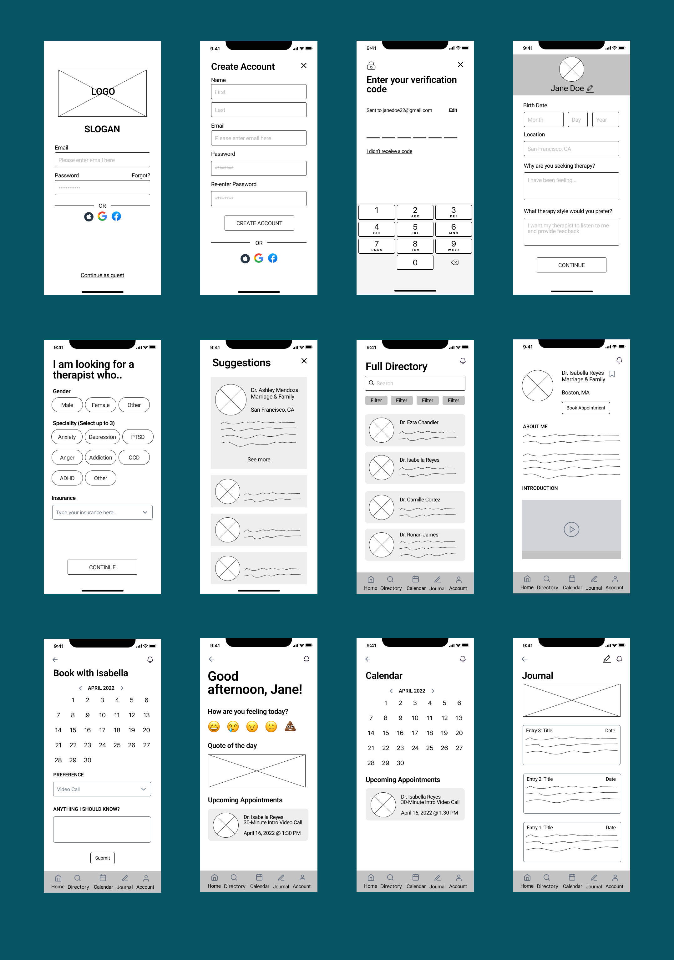


Edge Case #1: Incorrect Password Input
Designed for when users set up a password that does not fit criteria and/or does not match for verification purposes

Edge Case #2: Therapist Drop-Off
Designed for when a user is notified that their original therapist can no longer work with them
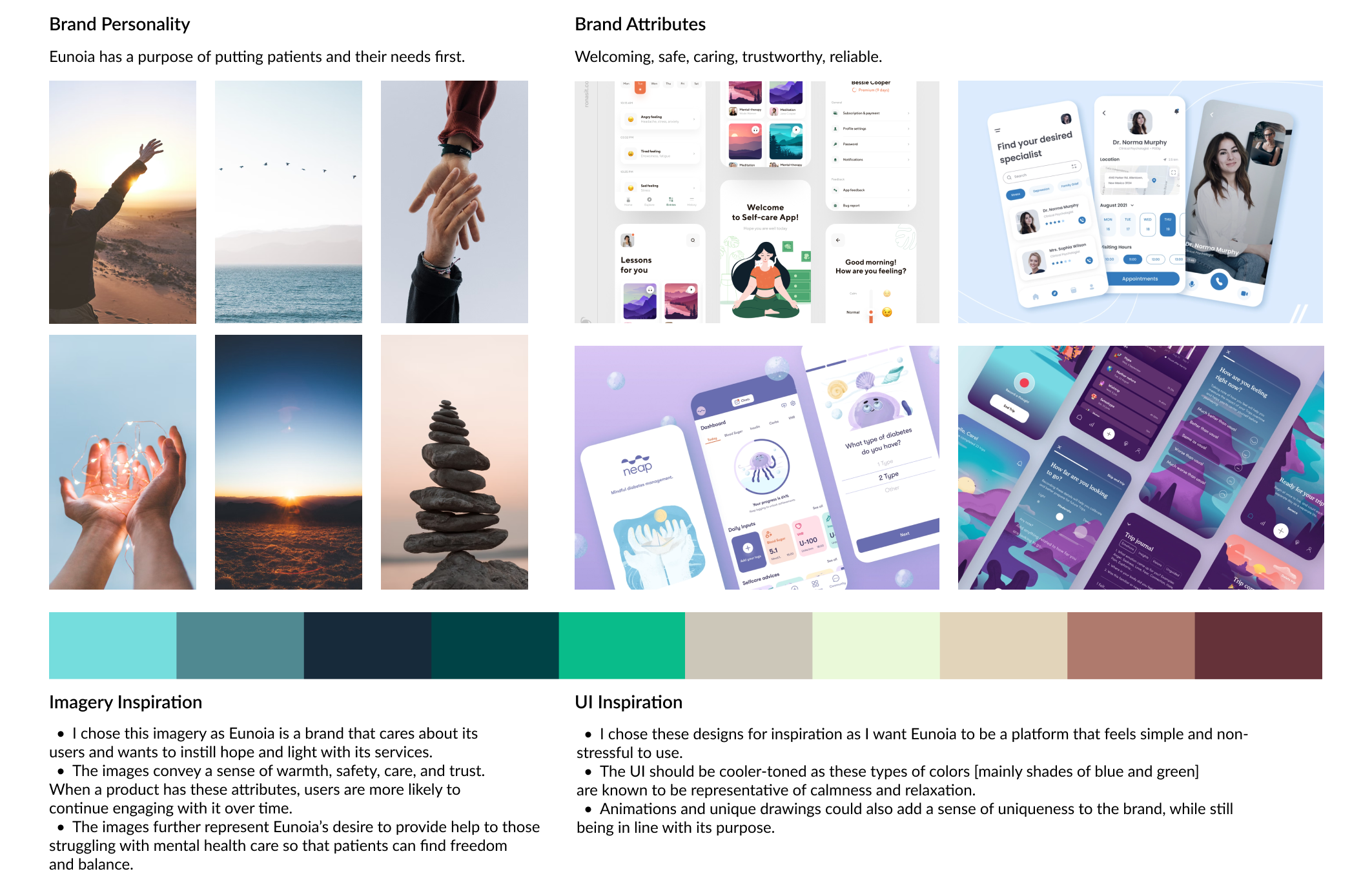
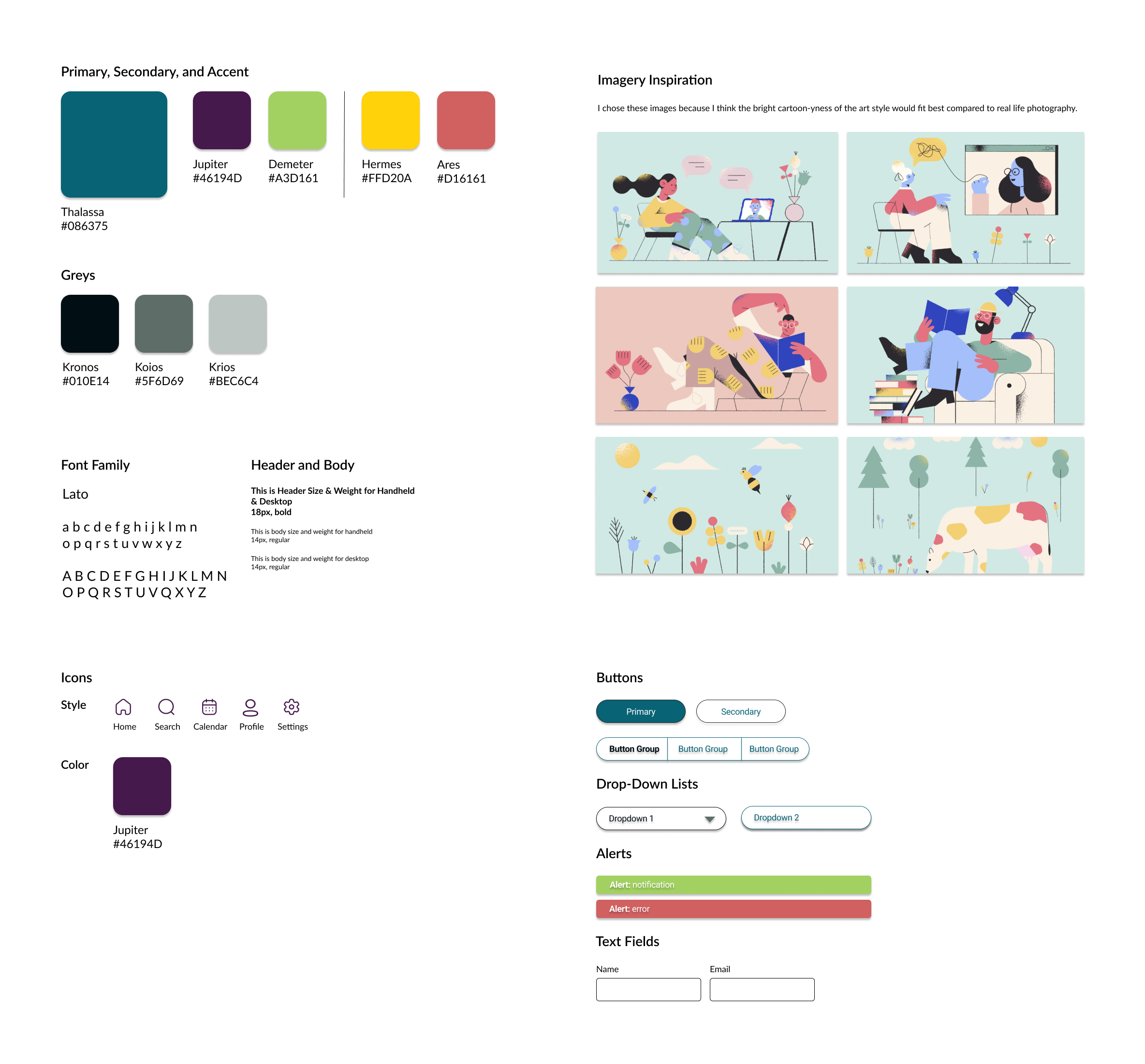
Branding & Style Guide
After I created my wireframes, I focused on building a consistent look and feel to Eunoia that best represented the brand’s personality. To promote feelings of care, calmness, and relaxation, I utilized cooler-toned colors of green and blue. I also incorporated cartoon-like imagery that would help mitigate the stressful associations of finding and connecting with a therapist online.
Moodboard
Style Guide
Hi-Fi Mockups
Once I was confident that my wireframes were best representative of the initial feedback I gained, I began creating my high-fidelity mockup screens that would be used for more rounds of task-based evaluation testing with users.

Prototype Usability Testing
After designing my mockups, I added animations and interactions to each screen to create my initial prototype. I conducted two rounds of usability tests, all via Zoom.
The first round of testing was conducted with seven fellow Springboard students from various cohorts. The second was with five participants that were hand-chosen based on their familiarity with my project (fellow designers that I previously worked with), as well as their lack of knowledge in UX design (non-designer friends and young professionals)
The decision to formulate my tests in this way allowed for me to get a broad range of feedback from both persona types that I then implemented to improve my overall prototype after each round of testing.
Iterations
Key improvements included creating better distinction between similar sounding action items (Exhibit A), as well as ensuring that the user has a clear direction as to what steps should be taken next (Exhibit B).
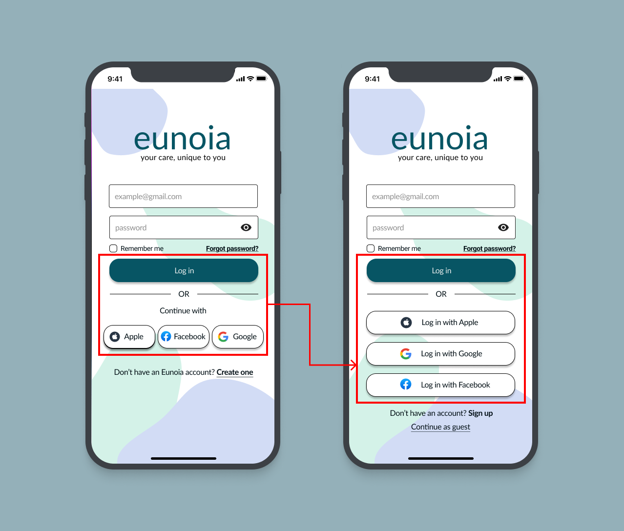
Exhibit A: there is a better distinction between “logging in” as a returning user and “signing up” as a new user.

Exhibit B: the user knows what to do when it is time for the appointment
#2
Reiterate designs as needed based on fresh feedback.
#3
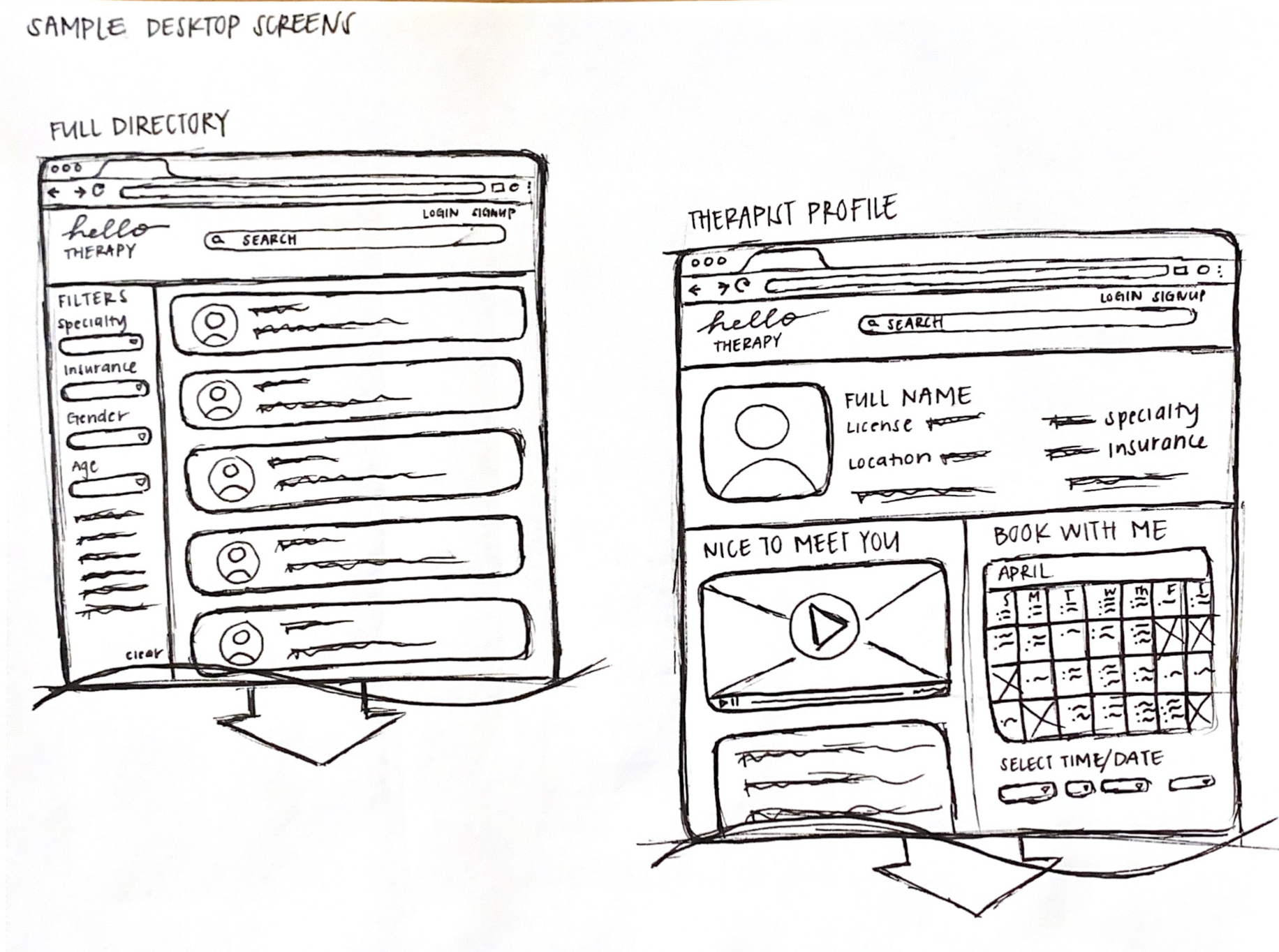
Continue development of a desktop version of eunoia to increase accessibility to the platform across multiple devices.
Reflection
Tackling the topic of mental health and teletherapy as my first major project was no easy feat. Looking back, I understand that there are many areas that I did not address that greatly limited the overall feasibility and usability of my application.
This includes the realities of the following:
There is a lack of mental health professionals and access to care in certain areas within the United States.
My initial interviews with five users are NOT fully representative of the millions of people who struggle with AMI.
There are user groups that I did not have the chance to speak to, including those with severe mental health conditions as well as actual therapists and social workers.
Knowing this, I now understand that the scope of my project could have been made smaller (ex. the community/city I live in) to ensure better focus on my target audience.
Nonetheless, I have learned the importance of keeping those who struggle with mental health at the forefront of every design decision I made – both big and small, throughout this entire process. From the user research, analysis, design, and usability testing, I tried my best to create a solution that would bring a higher level of confidence and ease to the user as they embarked on their unique journey to better mental health.