
Encouraging better spending habits and subscription maintenance
Problem
A fictional company’s product helps a user track their subscription fees but is only available via desktop. They want to launch a mobile version of this product to reach broader audiences. They have provided their business goals and user research findings, identified their competitors and target audience, and established their brand personality.
Solution
Create a mobile subscription tracking app that provides users with management control over their subscription payments, including the ability to cancel a subscription and add a new one.
⌛
Timeline
20 days (~90 hours)
My Role
Competitive research, branding, wireframing, prototyping, usability testing
🛠️
Tools
Figma
Design Process
👩🏽💻
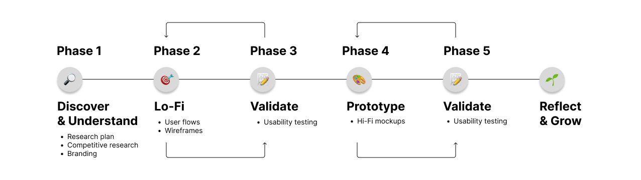
Phase 1: Setting up a research plan & brand
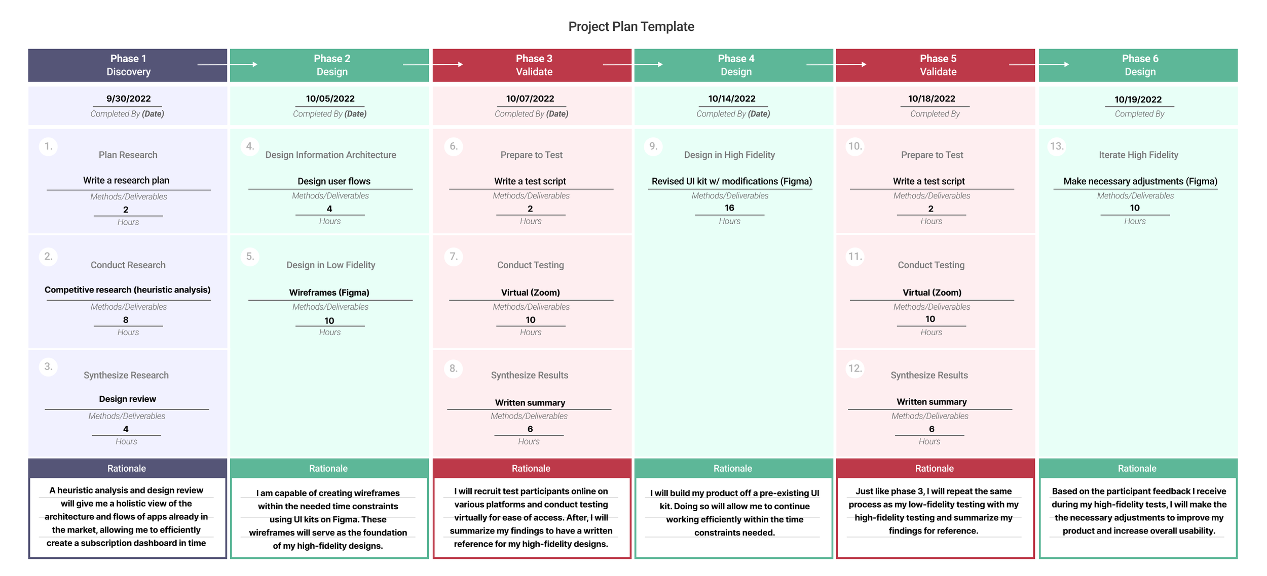
At the start of this project, I created a research plan with the goal of having a final product ready in 90 hours over the course of 19-20 days. In the plan shown below, I identified the research methods I believed would best allow me to understand how to approach designing this mobile subscription tracking app. I then set the timeframe I would use to efficiently create my information architecture, wireframes, hi-fidelity mockups, usability tests, and iterations.
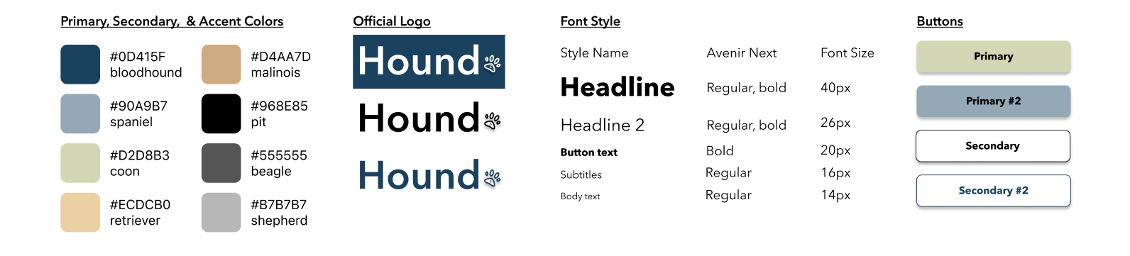
Branding & Style Guide
After setting up my research plan, I began creating a style guide. I focused on colors that promoted a sense of trustworthiness and care, as well as a friendly and calm feel. The name “Hound” was inspired by the breed of canines with the highest sense of smell that allows them to accurately “track down” things. Current and target users include middle-classed, tech savvy men and women over the age of 30 so I wanted to keep the overall design sleek and simple that would appeal to this specific demographic.
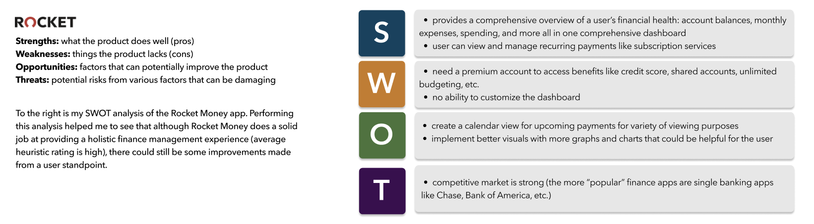
Competitive Research
Once the brand & style guide of the product was established, I chose three financial apps to analyze and rate based on three heuristics: flexibility and efficiency of use, user control and freedom, & help and documentation. Doing so allowed me to identify some of the UI elements within each app that are effective in granting the user a high level of seamless usability.

In addition to my heuristic analysis, I also conducted a modified SWOT analysis to further understand the elements that could either positively or negatively affect the user experience of each app. This process provided me with some ideas of the features I could implement into my own product that would thus give it more competitive edge.
Phase 2: User flows and wireframes
User flows
After wrapping up my competitive research analysis, I began creating user flows based on the company’s business goals of a user being able to freely manage their subscription services, including cancelling an unwanted subscription and adding a new one. Doing so allowed me to determine how many screens were necessary to provide the user with the best chances of success when completing these tasks and at what order they should be placed in.
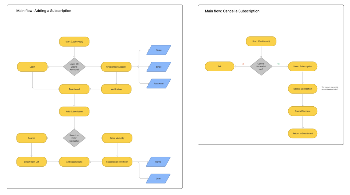
Wireframes
Once my user flows were defined, I utilized them as the baseline of my low-fidelity wireframes. These wireframes would then serve as the backbone of what my high-fidelity mockups would look like later.
Phase 3: Low-fidelity usability testing and initial improvements
Before moving on to creating my high-fidelity mockups, I interviewed five participants and had them test my wireframes to see if they were capable of both cancelling a subscription and adding a new subscription as a “returning” user. Below are some of my major findings:
Phase 4: Designing high-fidelity mockups & initial prototype
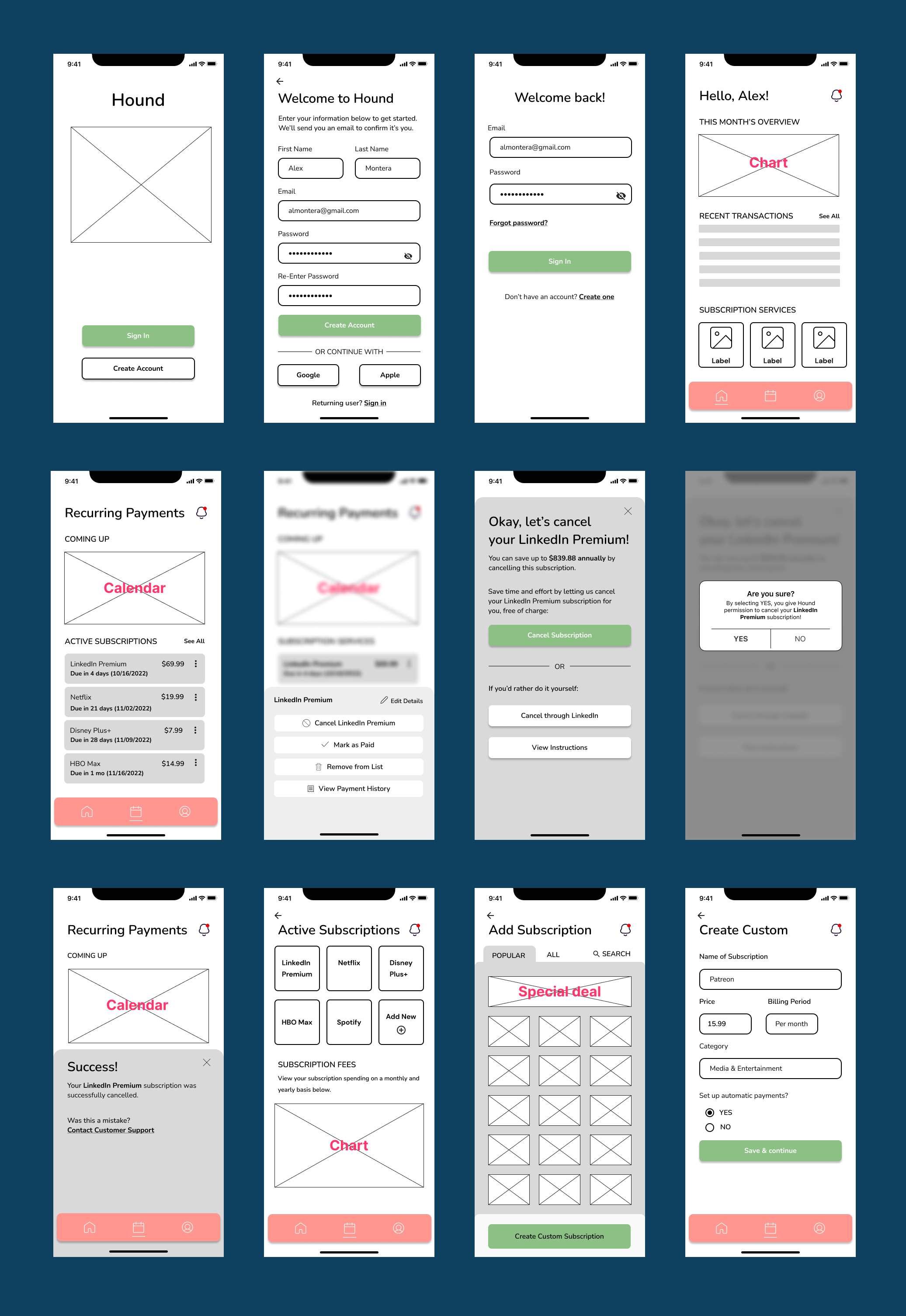
Mockups
Using my style guide, wireframes, and the feedback from my first round of usability testing as guides, I began to create my high-fidelity mockups, incorporating the UI elements that I believed would best make this product appealing to the eye and easy to use for another round of task-based testing with a new set of users.


Prototype
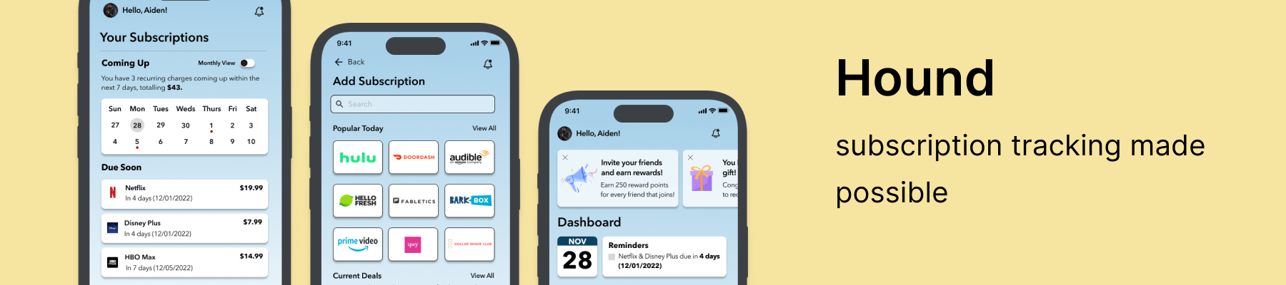
Check out Hound’s prototype below!
Phase 5: Validating my designs with usability testing & reiterating based on user feedback
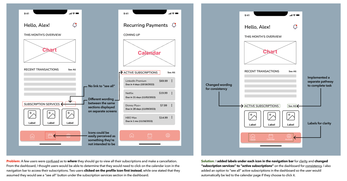
Once animations and interactions were added to each screen, I conducted another round of testing with five new participants. This time, I ensured that the users were able to 1) cancel a subscription (LinkedIn Premium) and 2) add a new subscription (Hulu No Ads) with ease as a “returning” user. I also took note of what secondary features users would notice first, including improvements made to the dashboard and subscription management screens I had implemented after the first round of testing with my initial wireframes. Some of my major findings include the following:

Reflection
I came in to revamp this company’s vision and take what would be normally displayed on a desktop screen into a smaller, handheld mobile device to reach a broader audience. Although I had full creative control, it was challenging to keep to a designated timeline. Furthermore, when laying out the main flows that align with the business goals, it was also quite challenging to place focus on what was already given to me, rather than trying to make this application “bigger” and “greater”. For example, it was tempting to try and make this subscription tracker app into a one-stop finance app like Mint, but as I continued to test my designs and reiterate based on user feedback, I remembered that it is critical to make improvements within the right context as future goals can always be established and worked on later.