

Providing customized holistic lifestyle plans to improve users’ health
Project Overview
Maka Health, a functional wellness company, is looking to revamp their demo app before launch. Their app is designed to allow users to upload their personal health data and have a community of practitioners, science-backed supplement recommendations, and unique holistic health programs recommended to them via their AI system. In this project, I – along with two other UX/UI designers – were tasked with redesigning the onboarding process and the home dashboard to improve overall visual hierarchy and improve user engagement with the app’s health tracking features.
Goals
The branding, previous user research, and existing onboarding and dashboard flows of the Maka Health demo app were provided to us prior to the start of this project. To make the most use of our time, the design team and I decided to place focus on auditing and iterating Maka Health’s current design system in relation to their onboarding and dashboard screens.
Timeline
4 weeks
My Role
Audit of onboarding screens & dashboard
Dashboard redesign
Research analysis
Tools
Figma
Design Process
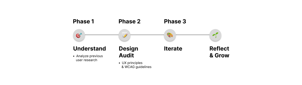
Phase 1: Understanding the current user pool + business goals
We began this project by analyzing the user research Maka Health’s design team conducted previously. Based on the research, we recognized that Maka Health’s current target demographic were older women (aged 35-55), also known as “digital health optimizers”, that had an interest in supporting their wellbeing by participating in holistic health practices such as supplement intake, yoga and meditation, etc. Maka also began implementing a feature that allows users to upload their nutritional genome data, similar to platforms like Ancestry or 23andMe, making the platform an all-encompassing health vault for the user.
In order to elevate their platform even further, we were tasked to ensure that the current demo app was:
supportive of this new genome feature, and
encouraging for the user to engage with (specifically with health tracking in “routes” and the data presented in the “data vault”)
Thus, my team and I focused on the following:
How might we revamp the app’s current features so that their users can utilize it to continue improving their health?
How might we improve the user experience of the onboarding process of Maka Health?
Phase 2: UX design audit of onboarding + dashboard demo screens
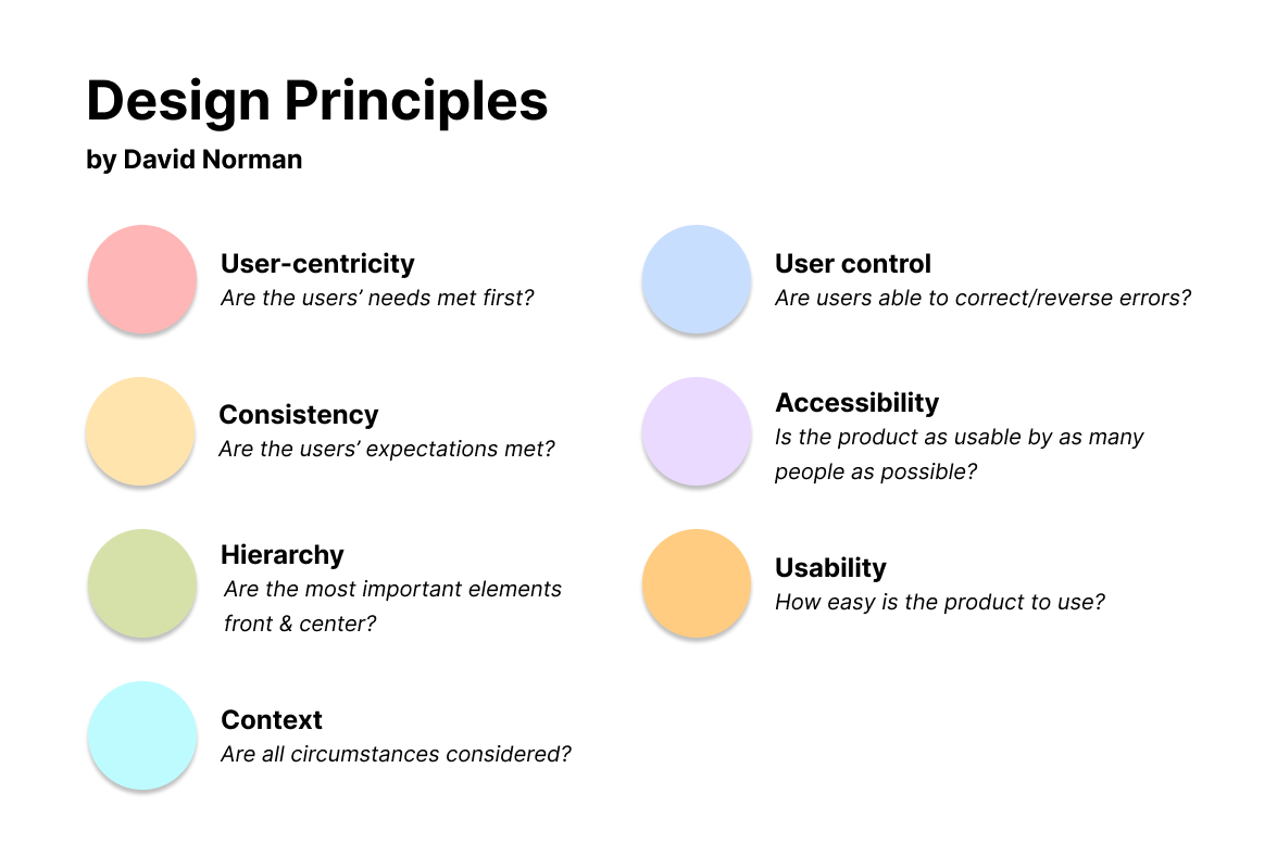
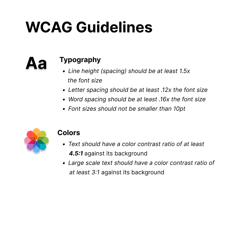
Moving forward, we conducted an audit based off of David Norman’s design principles & the WCAG guidelines:
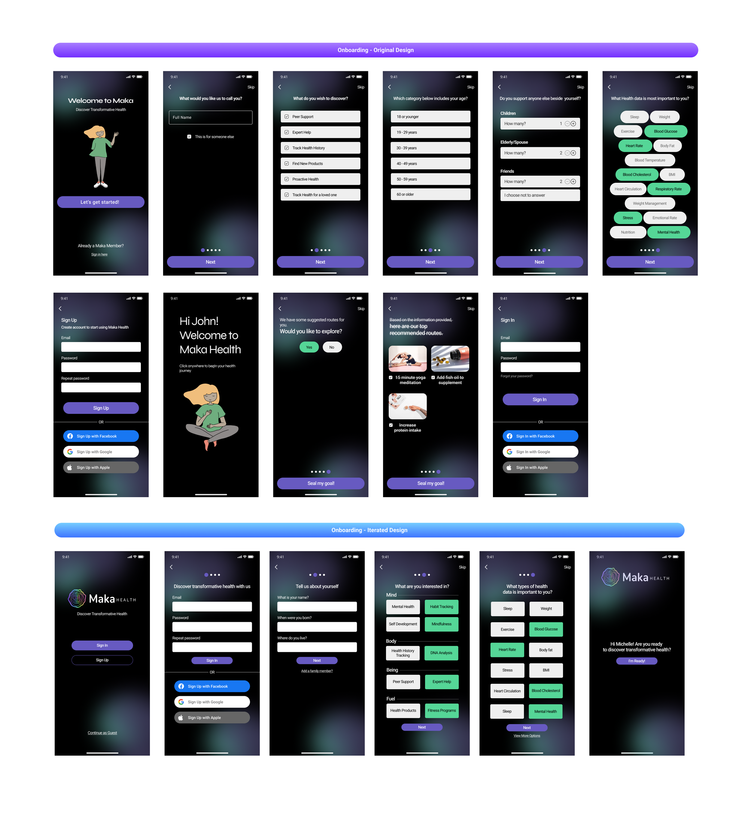
Onboarding
Inconsistent text sizing
title: 28pt
subheading: 16pt
button: 20pt
subheading #2: 18pt
body: 14pt

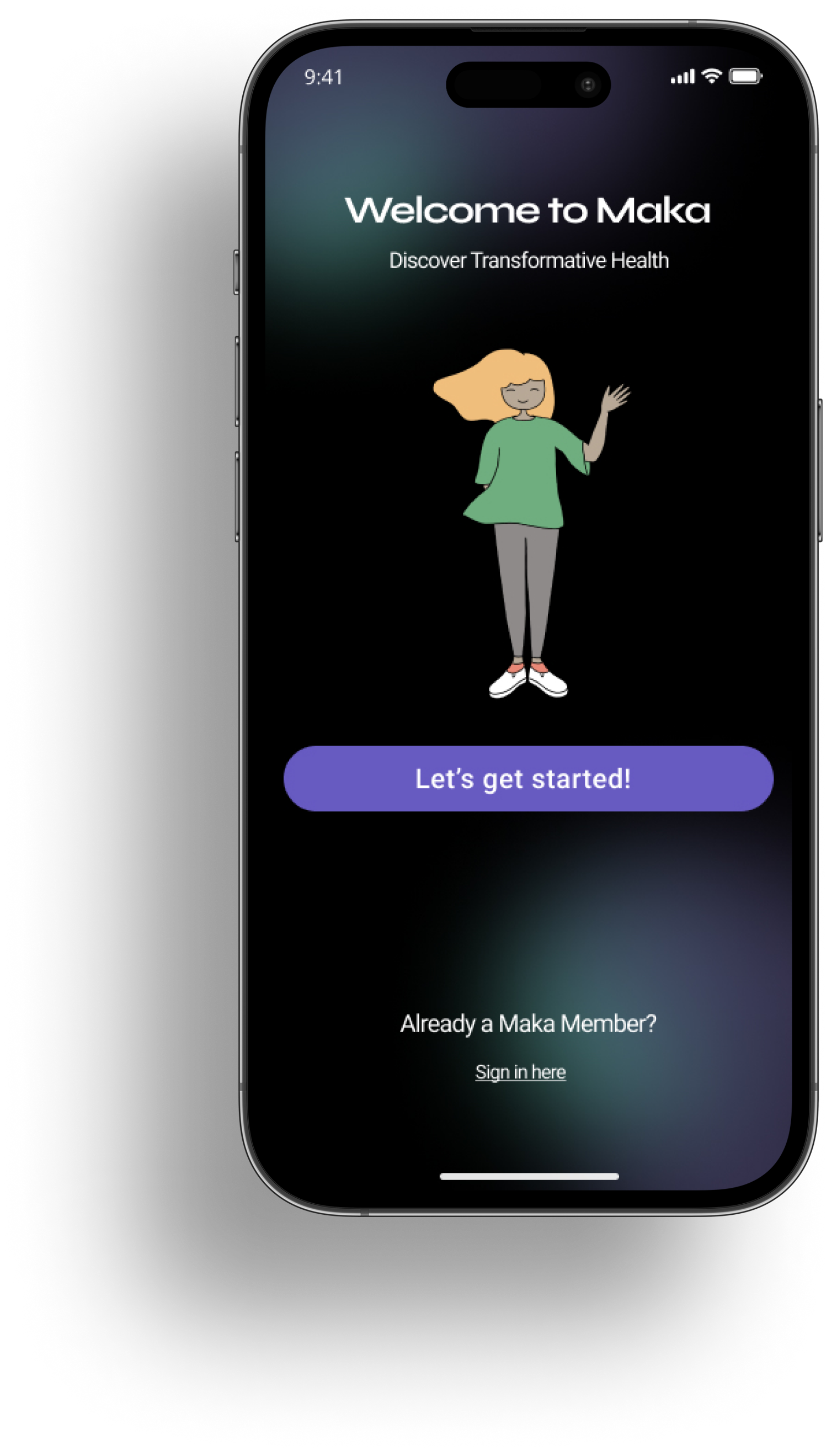
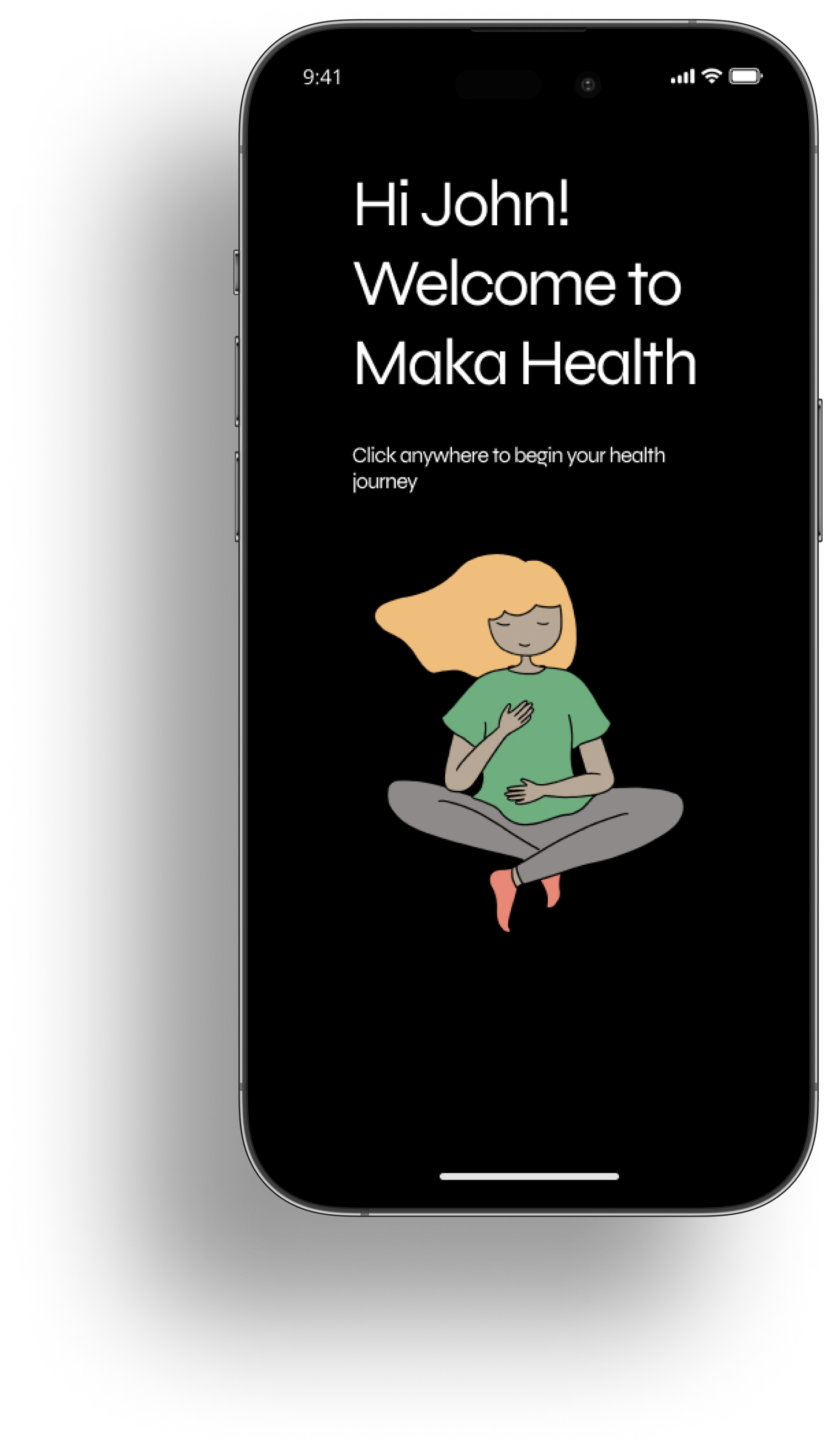
It is unclear to the user that Skye (the cartoon woman) is Maka’s representative

With the “skip” button in place, there are no directions provided to the user
This, in addition to the following screens, are meant for the user to provide basic information and therefore can be compiled together into 1-2 screens to make better use of spacing

The buttons used here are not consistent with the style guide
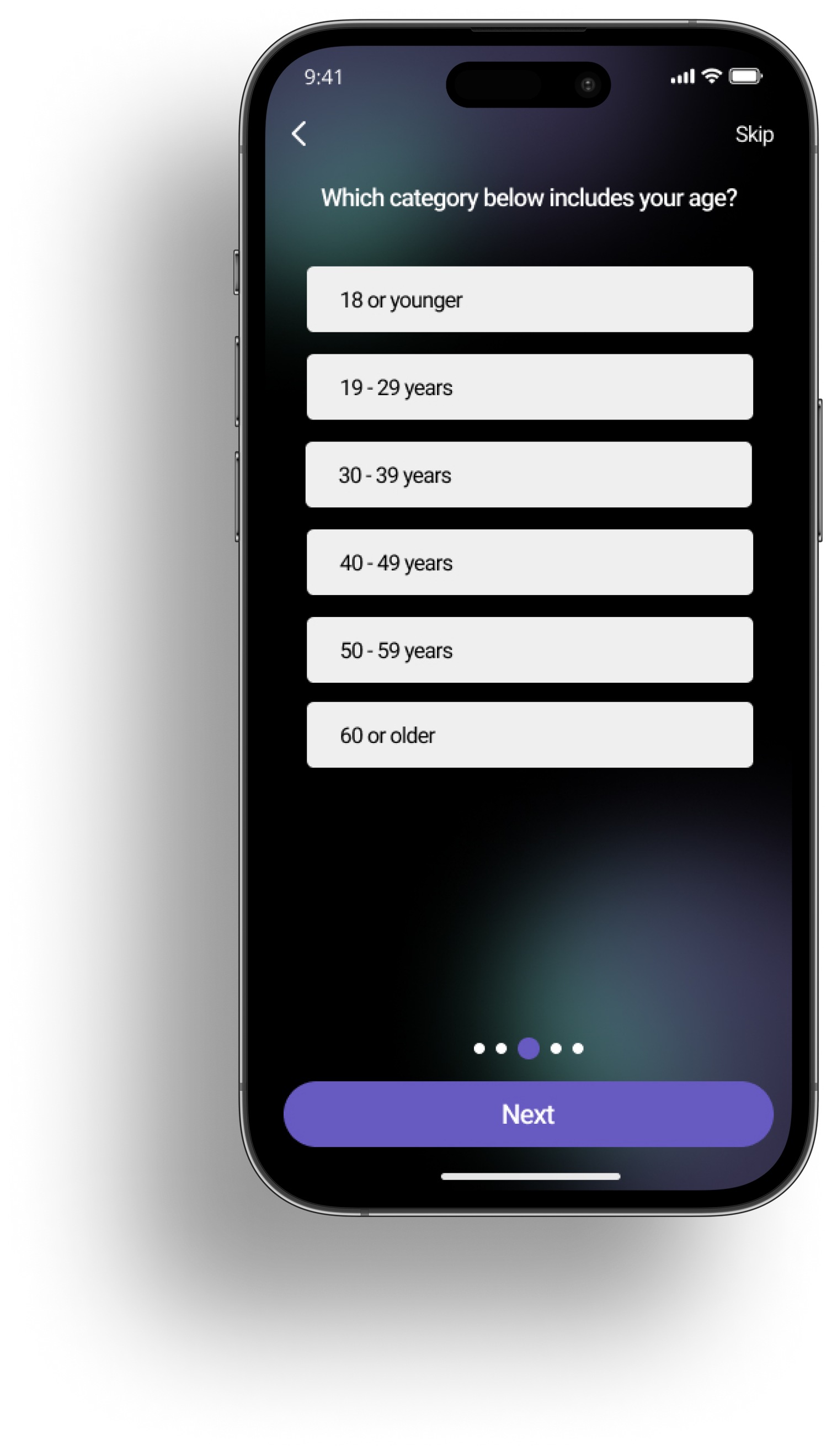
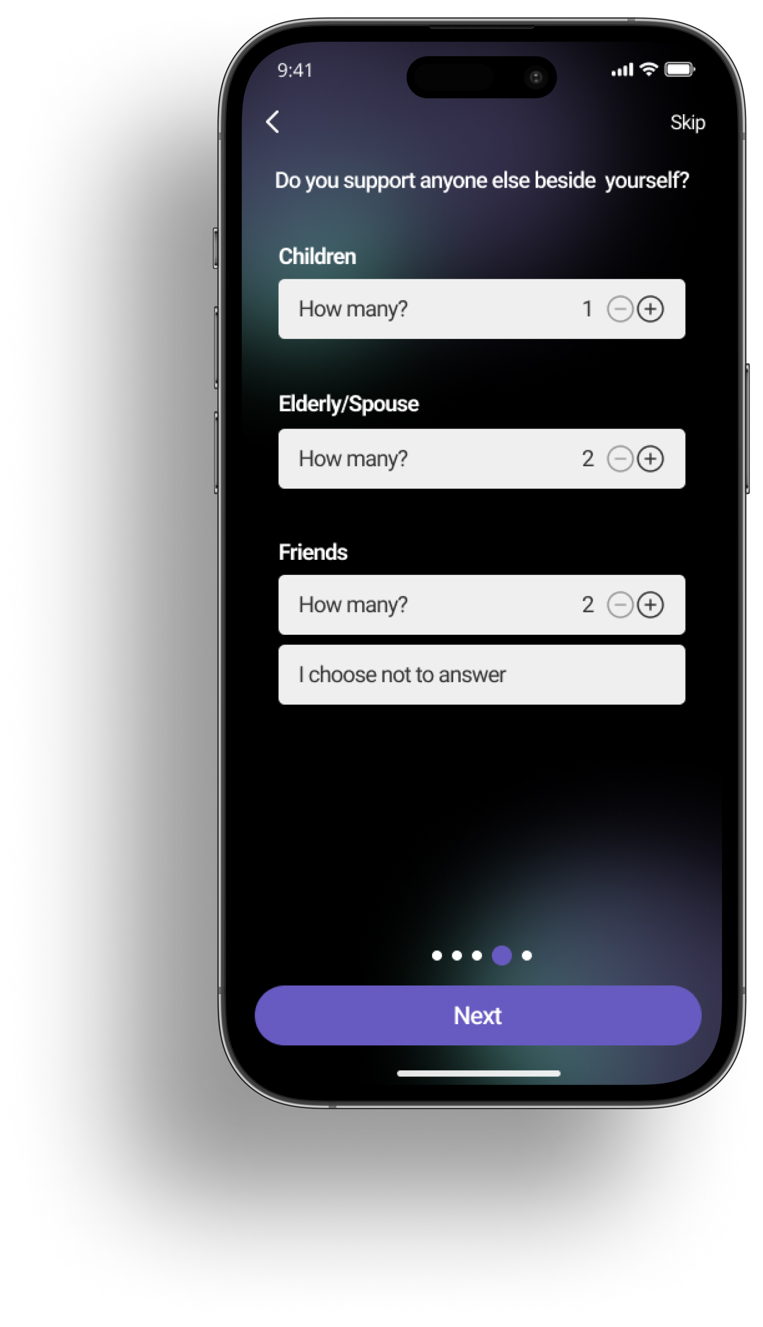
Inconsistent text sizing
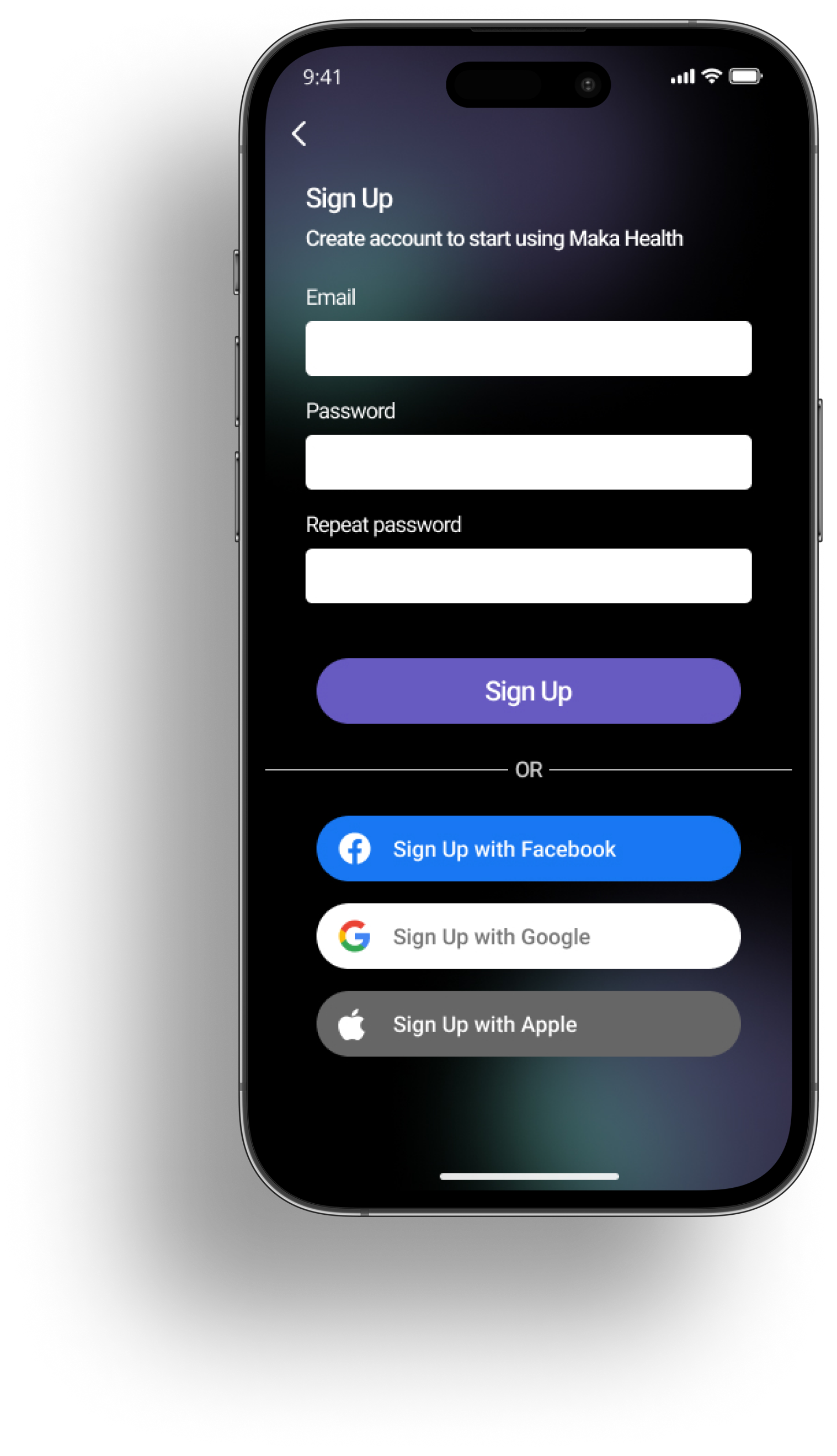
“Sign up with…” buttons are aligned to the left instead of the middle like the “Sign up” button
Text fields are smaller in size on this screen compared to previous screens
“Sign up” button is larger than other buttons
The order in which this screen is presented is not consistent with most other apps
The first welcome screen’s text was centered; here, the text is aligned to the left
Font styles are inconsistent; syne is used for the header and body text here whereas roboto was used in previous screens
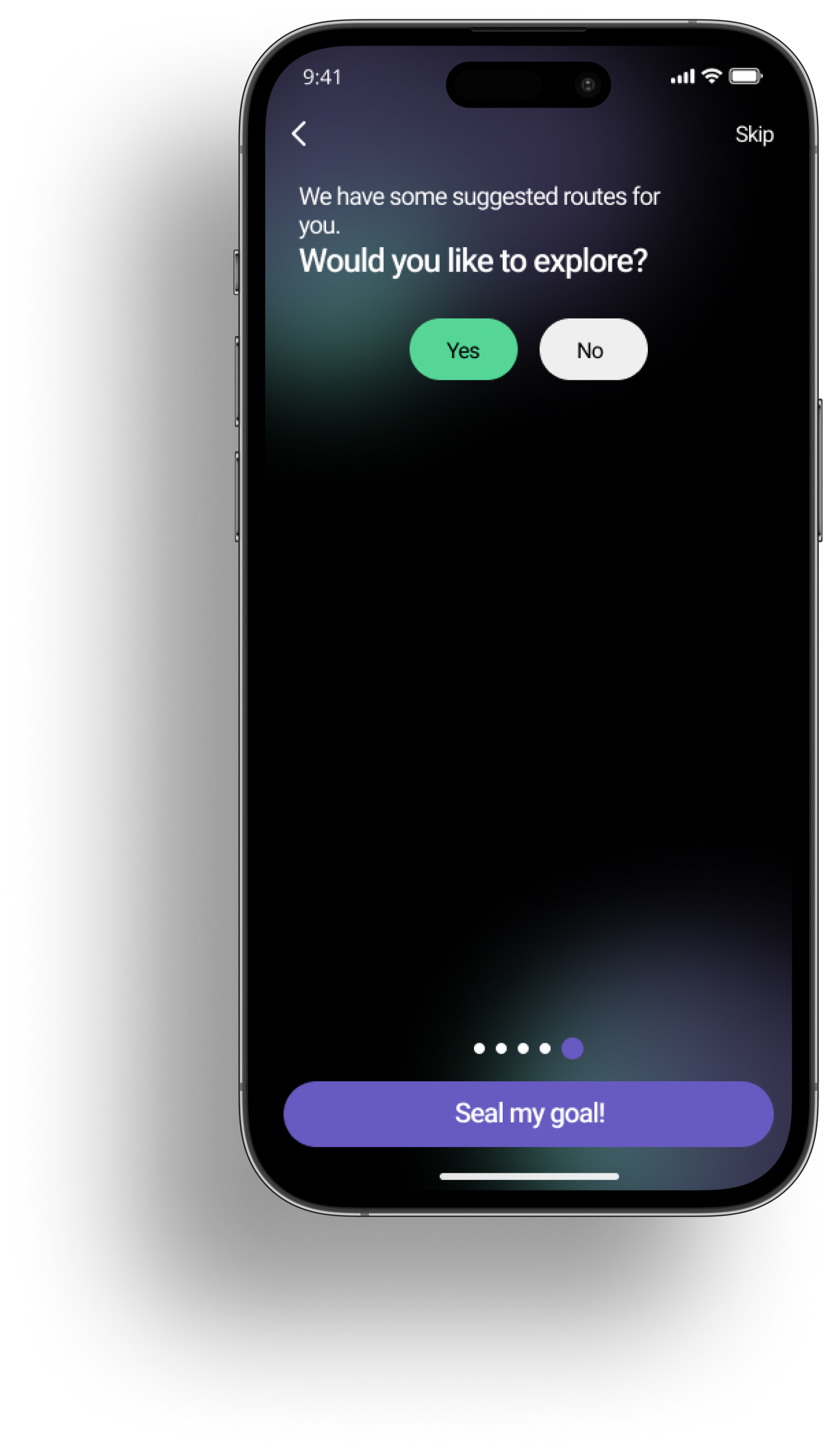
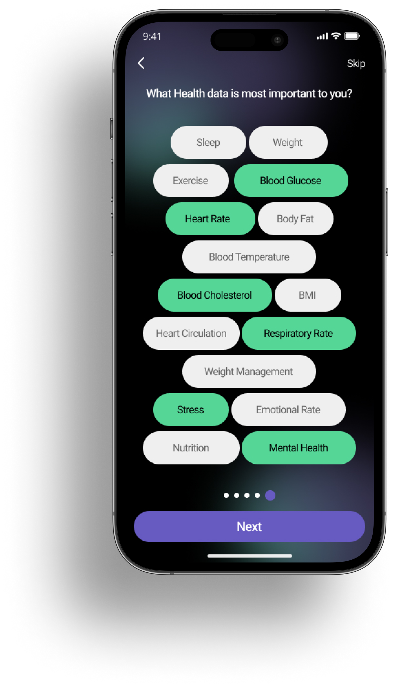
Inconsistent text sizing and styling; unclear what the focus of the screen is
As a new user, the meaning of “we have some suggested routes for you” could be unclear
Too much negative space past the buttons, and not enough spacing between both lines of main text

Similar to the “sign up” screen, there are text alignment and text field sizing inconsistencies
Suggestions
Have options for level of onboarding i.e. “do you want to complete full holistic health questionnaire right now?
Have Skye introduce Maka’s mission so the user is aware of her purpose as Maka’s representative
Add a “skip” or “view as guest” option in the onboarding process so users can view app features before committing to sign up
Explain what “routes” are on valuable health data screen
Dashboard
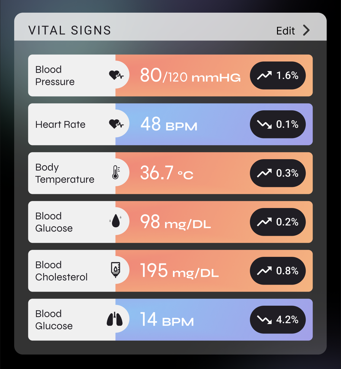
The colors/color gradients used in these sections do not match the mandatory 4.5:1 color contrast rule
Maximizing real estate could be improved, as these sections take up 50% of the dashboard screen
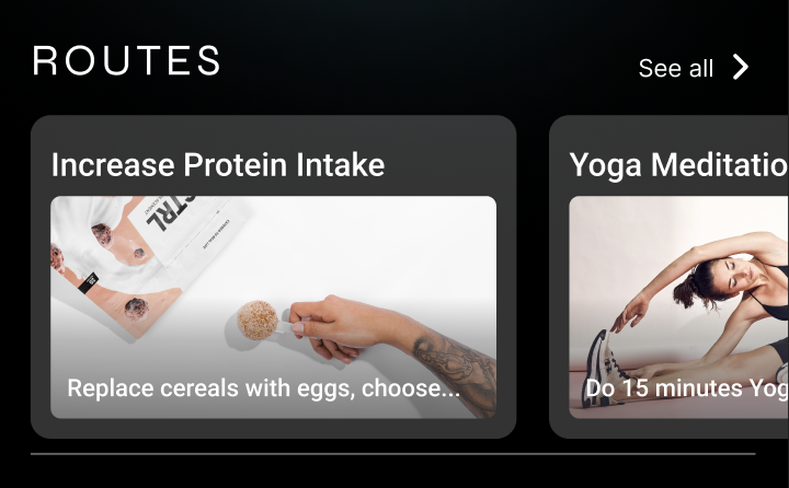
The “routes” section is one of the more important elements on the dashboard but there isn’t much emphasis currently placed on it
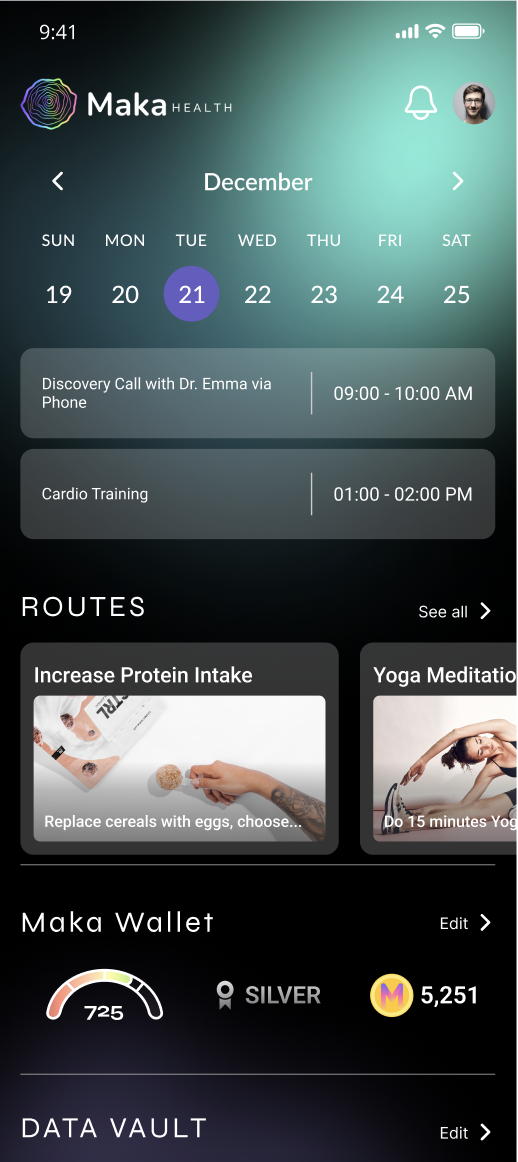
Some overall text sizing and style inconsistencies
Informational hierarchy could be improved, knowing that users should care most about the “routes” and “data vault”
No ability to customize dashboard, especially with health data displayed
🛠️
Phase 3: Redesign of onboarding + dashboard screens
We presented our design audit to Maka Health’s CEO and design team. Our audit was received positively and we were given the go ahead to begin redesigning with these updates on their end in mind:
Skye is no longer the Maka Health representative; she is to be removed from any screen
Given that Maka focuses on a holistic health approach, they would like to incorporate Maka’s 4 pillars (mind, body, being, and fuel) to the screen that asks what the user’s interests are and organize each topic under the corresponding pillar
Maka Health also agreed that having some sort of tutorial in place to take a new user through the onboarding process would be beneficial, but due to time constraints, we were not able to complete this as part of our final deliverable.
Final Designs
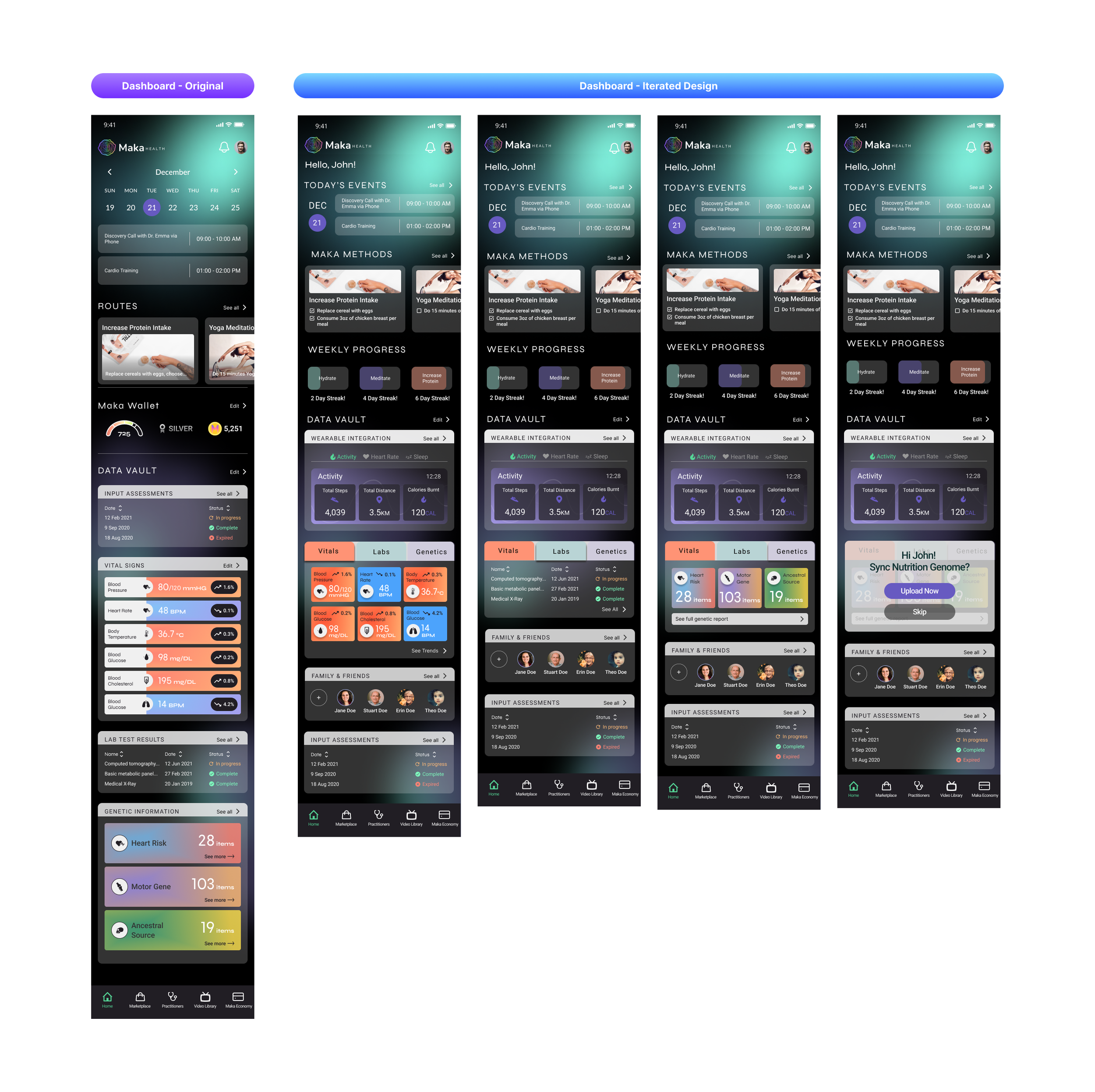
I primarily focused on making changes to the dashboard screen but I also provided some input into the redesign of the onboarding screens as well. Here were the key changes that were made to the dashboard:
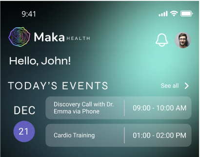
Added personalized greeting at the top
Condensed calendar to “Today’s Events” to minimize calendar view and save space
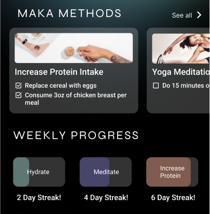
“Routes” changed to “Maka Methods” for new branding


⌛

👩🏽💻
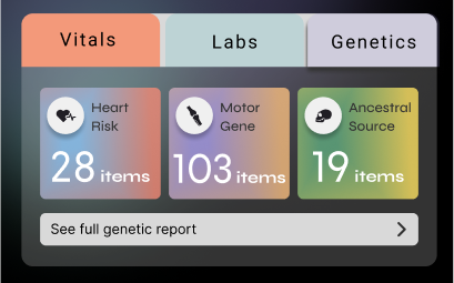
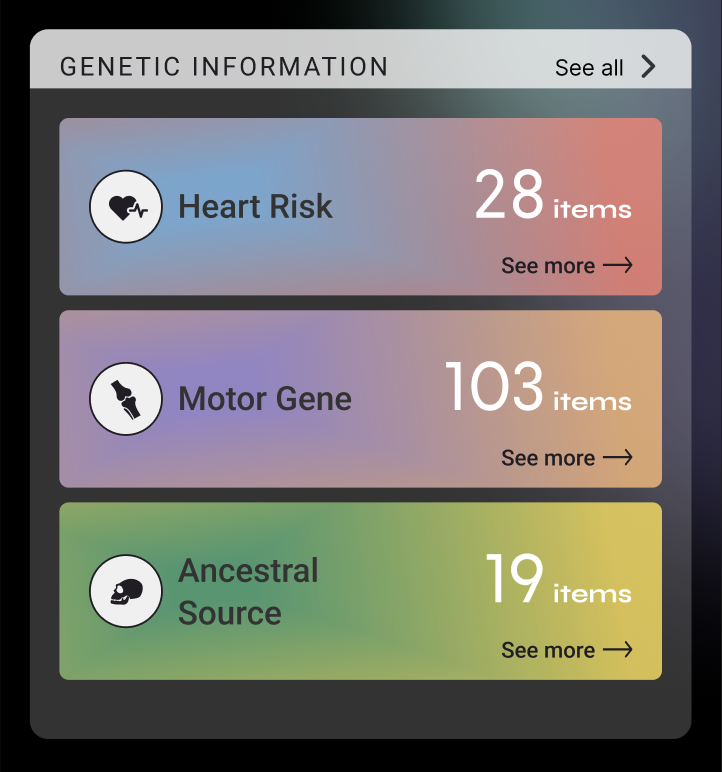
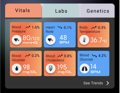
Added tabs to “Data Vault” so users can click between desired health data instead of scrolling
Added option for user to upload nutrition genome under the “Genetics” tab
Changed “Vitals” and “Genetics” data display to cards
Added “Weekly Progress” section to further encourage user to engage with their unique methods
Condensed cards to include checklist that could expand in pop up and take user to related info under “Video Library” tab
Reflection
Learning + collaboration: While working on this project, I enjoyed learning more about holistic health as it is a topic I am not generally too familiar with. Hearing how Maka Health came to be was also a very enlightening experience! The executive team is very passionate about Maka’s mission so it was great to hear their stories and unique viewpoints on the product. Furthermore, it was awesome getting to bounce ideas back and forth between my respective design team, as well as the stakeholders involved on Maka’s end. The collaboration aspect of this project was key in ensuring that this platform could be the best it could be, even though there were some time constraints that kept us from expanding further.
Team communication + progress records: Given that I was working with a team that had members located across the globe, it was crucial to ensure that we all kept the communication open and had multiple designated meeting times during the design process. Within my respective design team alone, we met 3x a week – once during our “all team” meeting with Maka, once before, and once after, so that we all were on the same page and could keep each other updated on our individual progress and next steps throughout the week. This, plus regular communication over text, email, and Slack, was critical in order for all of us to be in tune with one another and make sure the deliverables we presented to Maka each week were helpful and clear!
Next Steps
Had there been more time, I would have looked to make some major changes to Maka Health’s current style guide and branding that would align better with the WCAG guidelines. Although we brought up the color accessibility issues with the Maka team, they chose to not make any changes to their style guide at this time. Also, I would have tried implementing the tutorial feature they were opting for so that new users can get a better feel for what Maka Health has to offer!