
Boosting conversion rates to create new business opportunities
Project Overview
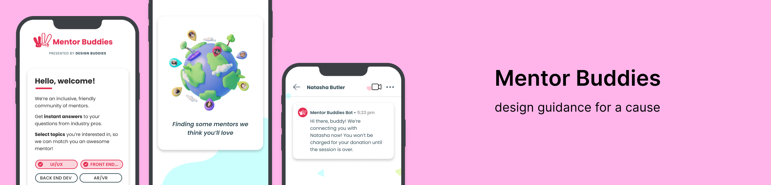
Mentor Buddies is a mobile app where members can find a design expert to chat with privately for for 15 minutes in exchange for a small donation to the mentor’s charity of choice. It is the sister app to Design Buddies, an inclusive community of tens of thousands of designers on Discord that hosts events, chats, and spaces for designers to learn, hang out, and meet other designers.
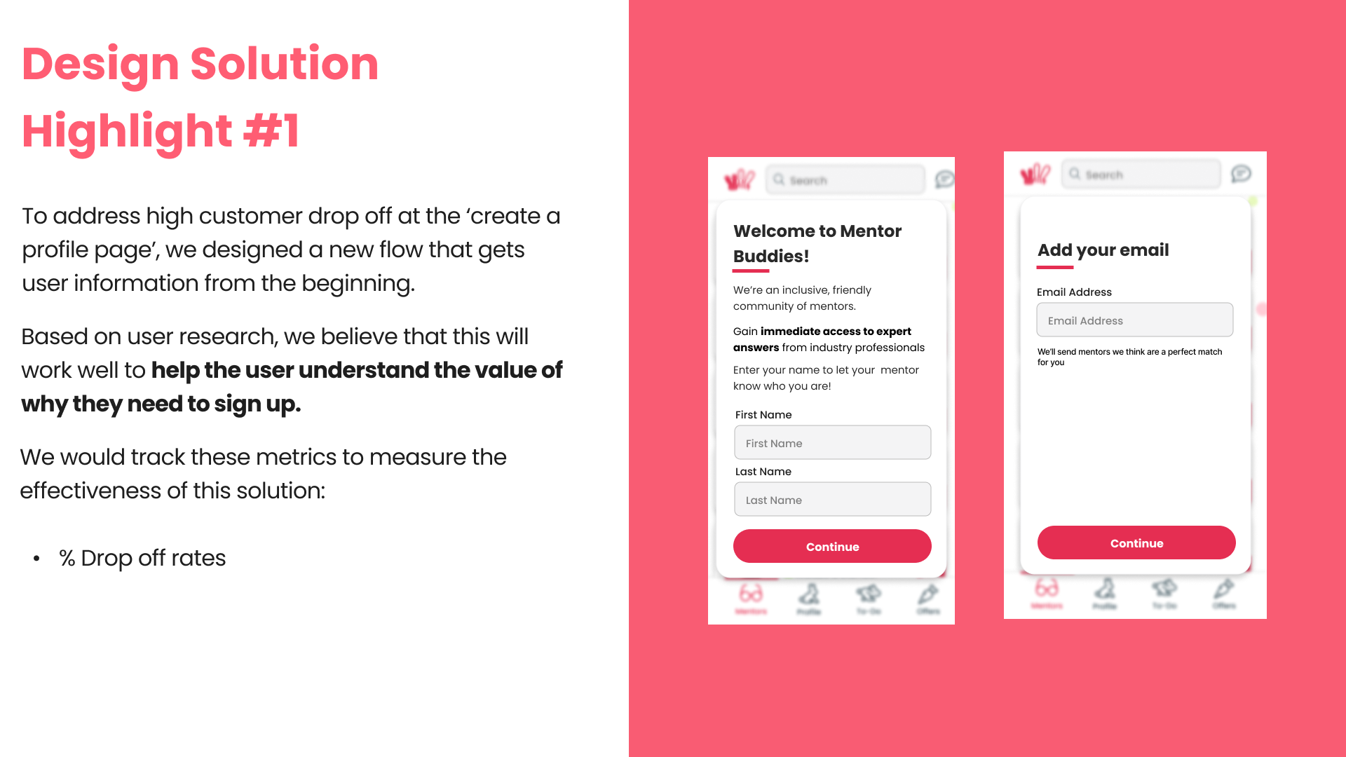
Problem: Mentor Buddies is currently struggling to retain new users and get them to follow through with initiating their first chat session with a mentor.
Solution: Using highlights from user feedback and app usage analytics, my team and I redesigned three specific aspects of Mentor Buddies’ onboarding process that showcased high drop off rates to help users feel more confident in making the most out of their Mentor Buddies account.
👩🏽💻
My Role
Research: user research analysis
Design: sketching, wireframing, high-fidelity mockups
🛠️
Key Findings
Tools
Figma, Mixpanel
Goals
Get new users to start their first chat session with a mentor
Grow “revenue” and community of mentors/mentees
Create an onboarding experience that allows users to easily and confidently find a mentor to chat with
What’s working?
Great feedback from the users that have initiated mentor sessions
After the first session, users typically come back for more
Good fit with existing community
Identifying potential points of friction within the onboarding process
Three key “smoke signals” found using app analytics
#2
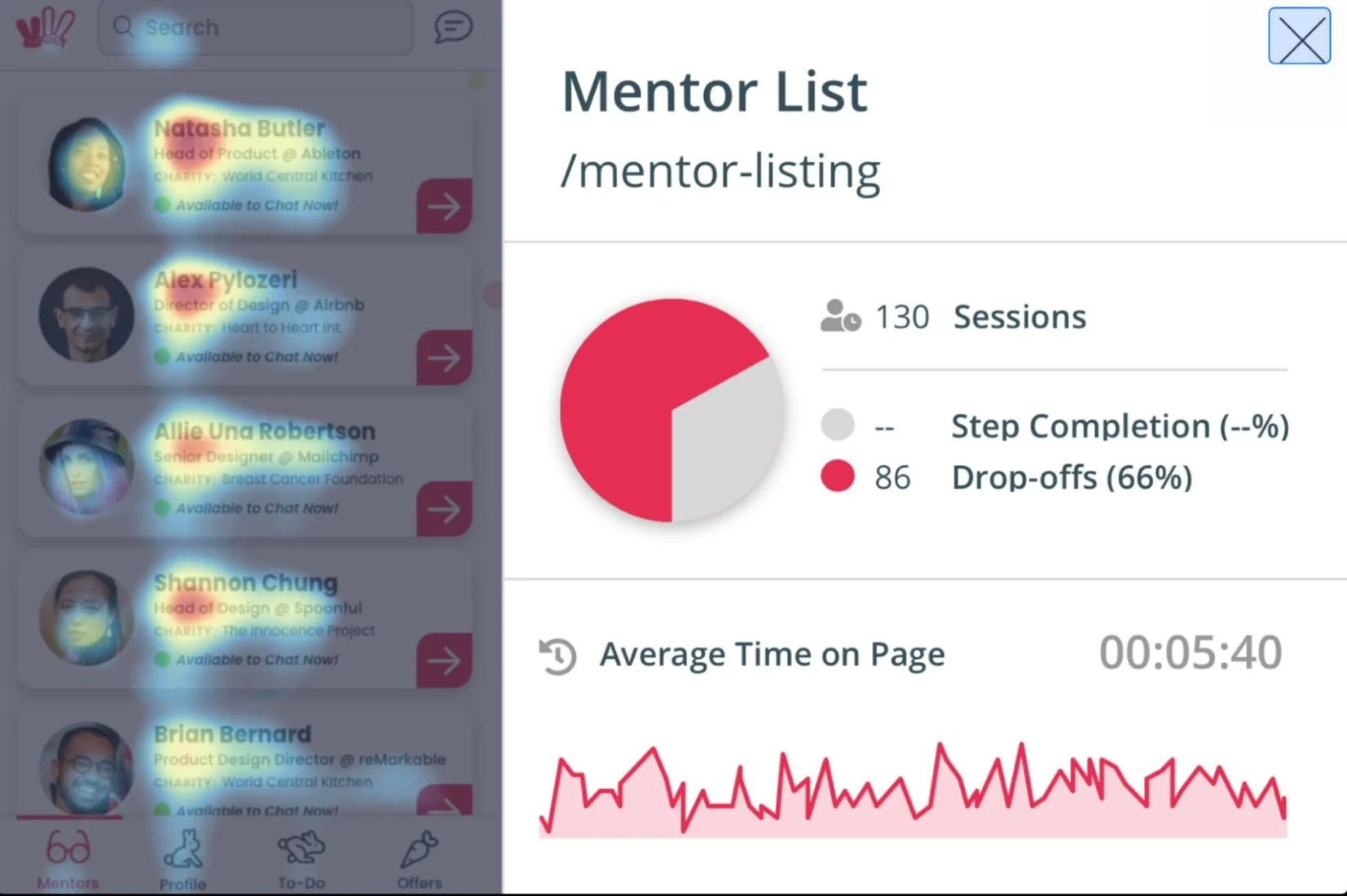
High drop-off and increased time spent on the “Mentor List” screen
Users seem to be spending a good chunk of time sifting through the mentor list in an effort to find one that could be a good match
#2
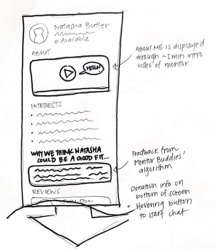
Incorporate a ~2 minute introduction video that better showcases the mentor’s personality and mentorship style and a blurb with Mentor Buddies’ feedback as to why it thinks this mentor is a good fit
design approach: find a way to make users feel like this mentor is approachable and allow the users to feel confident in Mentor Buddies’ matching algorithm

Bringing it all together
⌛
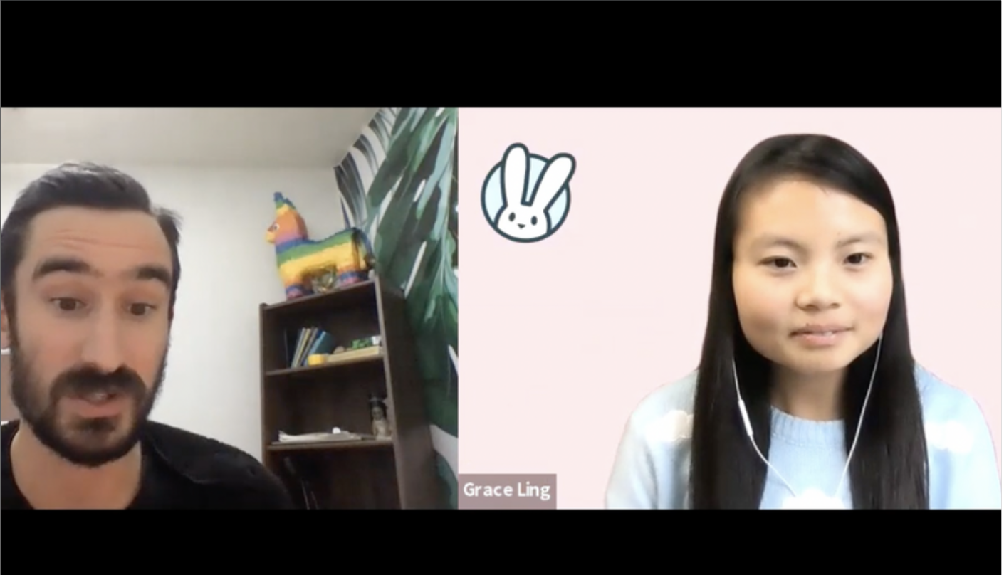
Stakeholder interview with Grace Ling, founder of Design Buddies
We wanted to learn more about Mentor Buddies’ current process, its challenges, and its desired business outcomes so we could create an effective solution.
We chatted with Grace first to discuss her team’s point-of-view on the constraints and challenges the app is currently facing.
What needs to be improved?
High dropoff in the onboarding process: most new users never make it to their first session
“We have some ideas, but don’t really know where to focus.” - Grace
Other constraints
Designed as a mobile app
Users must create an account, verify their phone number, and donate before starting a chat
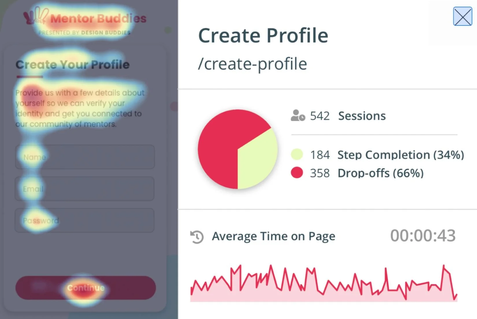
#1
High drop-off on “Create Profile” screen
Important to note given that this is an early step in the onboarding process
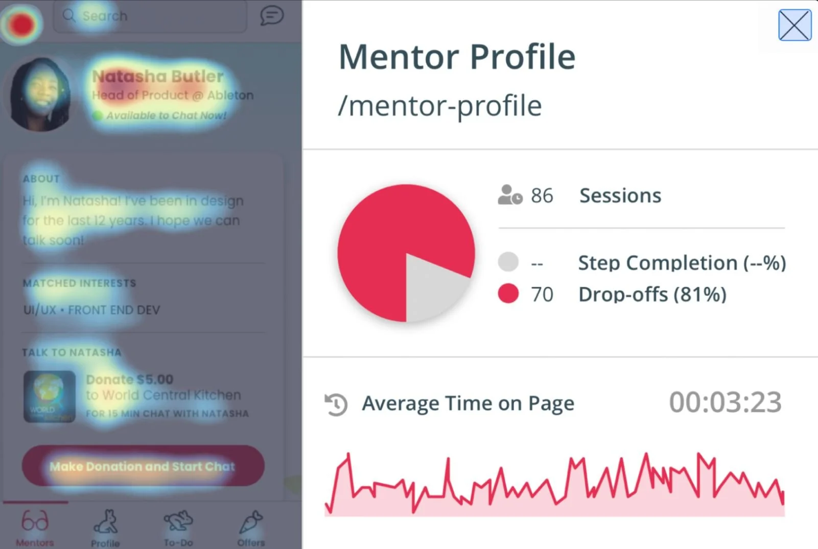
#3
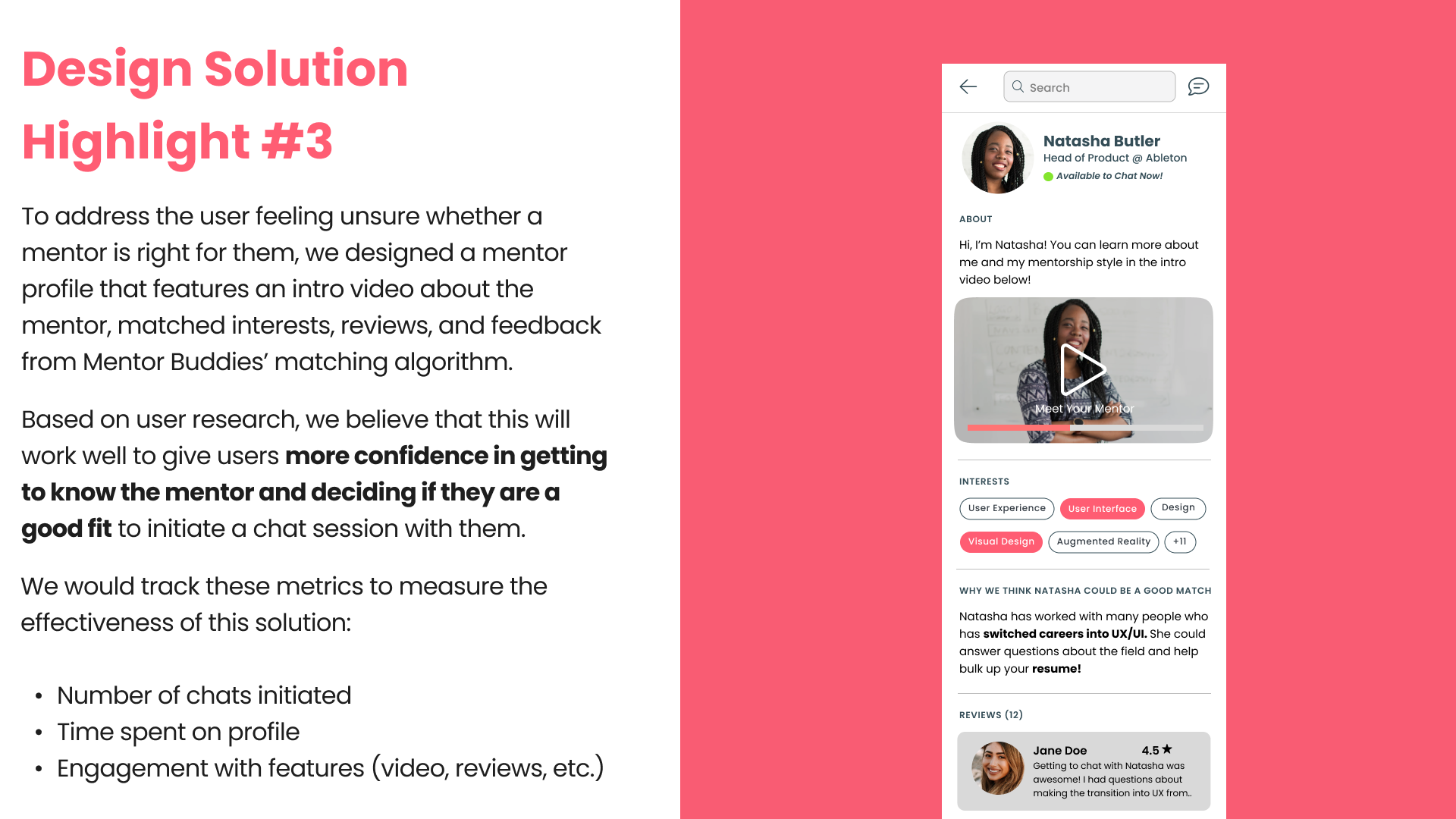
High drop-off and back button tapped often on “Mentor Profile” screen
Users are not following through on initiating a chat session with a mentor after viewing their profile
Figuring out the “why?” behind the numbers
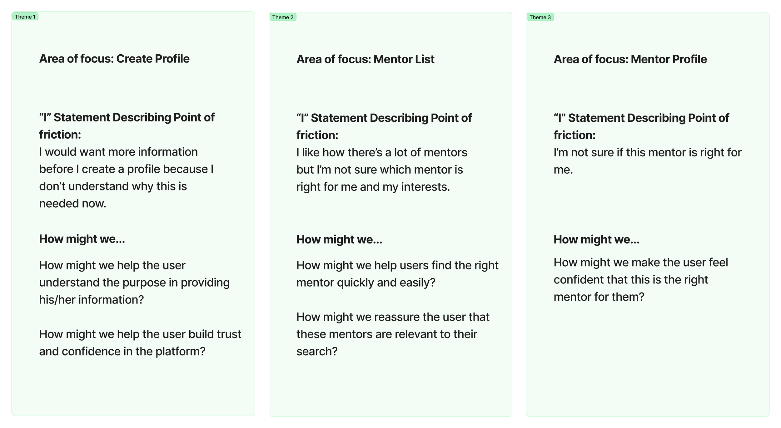
Came up with three key themes after synthesizing user feedback
My team and I analyzed and synthesized findings from usability tests to better understand a user’s journey navigating through Mentor Buddies’ onboarding process and the frustrations they had. In doing this, we identified three key themes to focus on moving forward when implementing improvements to the onboarding process.

Sketching out potential design solutions
Next, my team and I decided to split up and choose an area of focus to work on. I was tasked with Theme 3: Mentor Profile.
How might we make the user feel confident that this is the right mentor for them?
#1
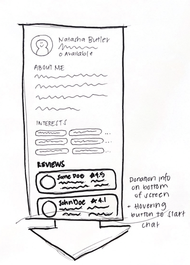
Incorporate about me (personal), interests (chat topics), and reviews from users that have worked with the mentor previously
design approach: find a way to display important information about the mentor that the user would want to know when making their decision to chat with them
Combining solutions and bringing sketches to life
After gaining feedback from my team, I began creating a high-fidelity mockup of the new Mentor Profile screen to visualize the details of the new features and how they might help users make a more confident decision in choosing the mentor and booking a call with them.

Next Steps
#1
Conduct usability tests to gain fresh feedback from users.
Timeline
~1 month
#2
Track usage metrics to measure effectiveness including: average time spent on each screen, % of drop-off rates, engagement with key features, etc.
#3
Reiterate designs and continue rounds of testing based on feedback and analysis results.